In [1]:
from lec_utils import *
Lecture 8
Web Scraping and APIs
EECS 398: Practical Data Science, Spring 2025
practicaldsc.org • github.com/practicaldsc/sp25 • 📣 See latest announcements here on Ed
Agenda 📆
- Introduction to HTTP.
- The structure of HTML.
- Parsing HTML.
- Example: Scraping quotes 💬.
- APIs and JSON.
Introduction to HTTP
Data sources
- Often, the data you need doesn't exist in "clean"
.csvfiles.
- Solution: Collect your own data from the internet!
For most questions you can think of, the answer exists somewhere on the internet. If not, you can run our own survey – also on the internet!
- If data is already nicely formatted in a table online, sometimes we can easily copy it and paste it into a
.csvor.tsvfile..tsvstands for "tab-separated values", just like.csvstands for "comma-separated values."
- For example, open the 2024 Michigan Football schedule here and click "Text Only".
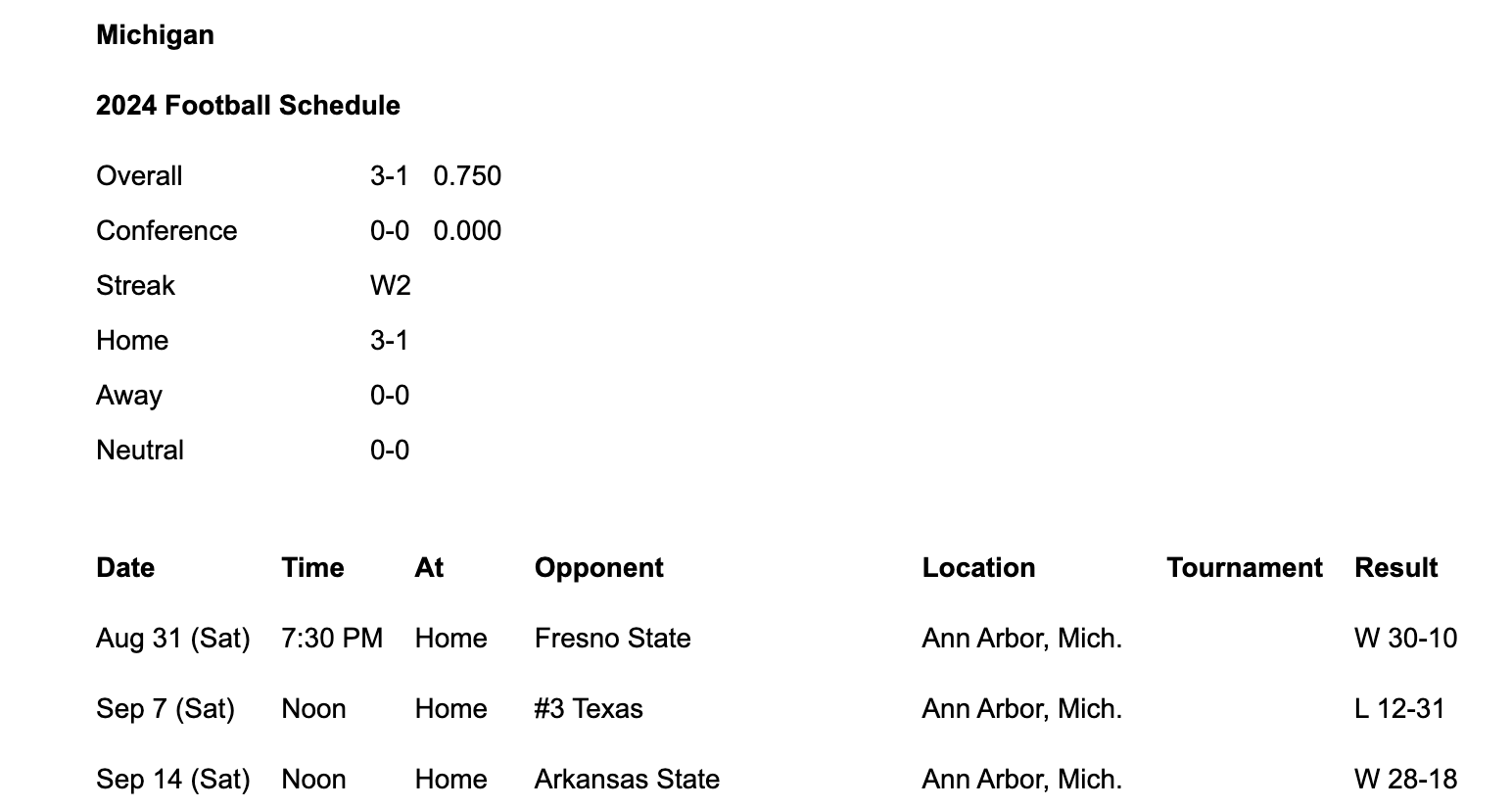
This is what you should see.
- Copy the text in the table at the bottom and save it in a file named
2024-schedule.tsvin yourdatafolder.
You may need to do some minor reformatting in the.tsvfile before this works.
As a challenge, see if you can find a way to do this entirely within your Terminal, i.e. without opening a text editor!
In [2]:
schedule = pd.read_csv('data/2024-schedule.tsv', sep='\t')
schedule.head()
Out[2]:
| Date | Time | At | Opponent | Location | Tournament | Result | |
|---|---|---|---|---|---|---|---|
| 0 | Aug 31 (Sat) | 7:30 PM | Home | Fresno State | Ann Arbor, Mich. | NaN | W 30-10 |
| 1 | Sep 7 (Sat) | Noon | Home | #3 Texas | Ann Arbor, Mich. | NaN | L 12-31 |
| 2 | Sep 14 (Sat) | Noon | Home | Arkansas State | Ann Arbor, Mich. | NaN | W 28-18 |
| 3 | Sep 21 (Sat) | 3:30 PM | Home | #11 USC | Ann Arbor, Mich. | NaN | W 27-24 |
| 4 | Sep 28 (Sat) | Noon | Home | Minnesota | Ann Arbor, Mich. | NaN | - |
- For Wikipedia specifically, you can use Wikitable2CSV, which converts Wikipedia tables to
.csvfiles for you.
Programatically accessing data
- We won't always be able to copy-paste tables from online, and even when we can, it's not easily reproducible.
What if mgoblue.com didn't have a "Text Only" option? Or what if the schedule changes – how can I prevent myself from having to copy-and-paste again?
- To programmatically download data from the internet, we'll need to use the HTTP protocol.
By "programmatically", we mean by writing code.
- We'll cover the essentials of how the internet works for the purposes of accessing data, but for more details, take EECS 485.
The request-response model
- HTTP stands for Hypertext Transfer Protocol.
It was developed in 1989 by Tim Berners-Lee (and friends). The "S" in HTTPS stands for "secure".
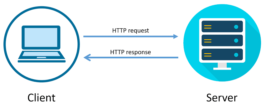
- HTTP follows the request-response model, in which a request is made by the client and a response is returned by the server.
- Example: YouTube search 🎥.
- Consider the following URL: https://www.youtube.com/results?search_query=luka+lakers+trade.
- Your web browser, a client, makes an HTTP request with a search query.
- The server, YouTube, is a computer that is sitting somewhere else.
- The server returns a response that contains the search results.
- Note: ?search_query=luka+lakers+trade is called a "query string."
- When a request is sent to view content on a webpage, the server must:
- process your request (i.e. prepare data for the response).
- send content back to the client in its response.
- Remember, servers are computers. Someone has to pay to keep these computers running.
Every time you access a website, someone has to pay.
- If you make too many requests, the server may block your IP address, or you may even take down the website!
A journalist scraped and accidentally took down the Cook County Inmate Locater, and as a result, inmate's families weren't able to contact them while the site was down.
HTTP request methods
- There are several types of request methods; see Mozilla's web docs for a detailed list.
GETis used to request data from a specified resource.
Almost all of the requests we'll make in this class areGETrequests.
To load websites, your web browser uses a lot ofGETrequests!
POSTis used to send data to the server.
For example, uploading a photo to Instagram or entering credit card information on Amazon.
- You can make requests directly in your Terminal using the
curlmethod, which you'll learn more about in EECS 485. Here, we'll make requests using therequestsPython module.
There are other packages that work similarly (e.g.urllib), butrequestsis arguably the easiest to use.
In [3]:
import requests
Example: GET requests via requests
- For example, let's try and learn more about the events listed on the Happening @ Michigan page, https://events.umich.edu.
In [4]:
res = requests.get('https://events.umich.edu')
resis now aResponseobject.
In [5]:
res
Out[5]:
<Response [200]>
- The
textattribute ofresis a string that containing the entire response.
In [6]:
type(res.text)
Out[6]:
str
In [7]:
len(res.text)
Out[7]:
64034
In [8]:
print(res.text[:2000])
<!DOCTYPE html>
<html lang="en">
<!--
     :::    :::   :::   :::          :::::::::: :::     ::: :::::::::: ::::    ::: ::::::::::: ::::::::
    :+:    :+:  :+:+: :+:+:         :+:        :+:     :+: :+:        :+:+:   :+:     :+:    :+:    :+:
   +:+    +:+ +:+ +:+:+ +:+        +:+        +:+     +:+ +:+        :+:+:+  +:+     +:+    +:+
  +#+    +:+ +#+  +:+  +#+        +#++:++#   +#+     +:+ +#++:++#   +#+ +:+ +#+     +#+    +#++:++#++
 +#+    +#+ +#+       +#+        +#+         +#+   +#+  +#+        +#+  +#+#+#     +#+           +#+
#+#    #+# #+#       #+#        #+#          #+#+#+#   #+#        #+#   #+#+#     #+#    #+#    #+#
########  ###       ###        ##########     ###     ########## ###    ####     ###     ########
Version: 6.0 - Mustard's Retreat
-->
    <head>
        <meta name="viewport" content="initial-scale=1, maximum-scale=1">
        <meta http-equiv="Content-Type" content="text/html; charset=UTF-8"/>
                <title>Happening at the University of Michigan | Happening @ Michigan</title>
                <link rel="icon" sizes="16x16" href="/favicon.ico">
        <base href="https://events.umich.edu/" />
						    <meta property="og:title" content="Happening @ Michigan" />
		  						    <meta property="og:image" content="default-image.png" />
        							<link rel="stylesheet" href="css/jquery-ui-custom.css" /> <link rel="stylesheet" href="packages/umevents/css/jquery-ui.structure.min.css" />
<link rel="stylesheet" href="packages/umevents/css/jquery-ui.theme.min.css" />
<link rel="stylesheet" href="css/main.css" />
							<script type="text/javascript" src="js-dist/jquery.min.js"></script>
<script type="text/javascript" src="js-dist/jquery-ui.min.js"></script>
<script type="text/javascript" src="js/modals.js"></script>
<script type="text/javascript" src="js/infoPoint.js"></script>
<script type="text/javascript" src="js/jquery.unveil.js"></script>
<script type="text/javascript" src="js/jquery.windowactio
- The response is a string containing HTML, the markup language used to format information on the internet. The events data we're looking for is in
res.textsomewhere, but we have to search for it and extract it.
- The following call to
requests.postmakes aPOSTrequest to https://httpbin.org/post, with a'name'parameter of'Go Blue'.
In [9]:
post_res = requests.post('https://httpbin.org/post',
                         data={'name': 'Go Blue'})
post_res
Out[9]:
<Response [502]>
In [10]:
post_res.text
Out[10]:
'<html>\r\n<head><title>502 Bad Gateway</title></head>\r\n<body>\r\n<center><h1>502 Bad Gateway</h1></center>\r\n</body>\r\n</html>\r\n'
- Now, the response is a string describing a JSON object. We'll learn how to work with these later in the lecture, but for now, note that we can use the
.json()method to convert it to a Python dictionary.
In [11]:
post_res.json()
---------------------------------------------------------------------------
JSONDecodeError                           Traceback (most recent call last)
File ~/miniforge3/envs/pds/lib/python3.10/site-packages/requests/models.py:974, in Response.json(self, **kwargs)
    973 try:
--> 974     return complexjson.loads(self.text, **kwargs)
    975 except JSONDecodeError as e:
    976     # Catch JSON-related errors and raise as requests.JSONDecodeError
    977     # This aliases json.JSONDecodeError and simplejson.JSONDecodeError

File ~/miniforge3/envs/pds/lib/python3.10/json/__init__.py:346, in loads(s, cls, object_hook, parse_float, parse_int, parse_constant, object_pairs_hook, **kw)
    343 if (cls is None and object_hook is None and
    344         parse_int is None and parse_float is None and
    345         parse_constant is None and object_pairs_hook is None and not kw):
--> 346     return _default_decoder.decode(s)
    347 if cls is None:

File ~/miniforge3/envs/pds/lib/python3.10/json/decoder.py:337, in JSONDecoder.decode(self, s, _w)
    333 """Return the Python representation of ``s`` (a ``str`` instance
    334 containing a JSON document).
    335
    336 """
--> 337 obj, end = self.raw_decode(s, idx=_w(s, 0).end())
    338 end = _w(s, end).end()

File ~/miniforge3/envs/pds/lib/python3.10/json/decoder.py:355, in JSONDecoder.raw_decode(self, s, idx)
    354 except StopIteration as err:
--> 355     raise JSONDecodeError("Expecting value", s, err.value) from None
    356 return obj, end

JSONDecodeError: Expecting value: line 1 column 1 (char 0)

During handling of the above exception, another exception occurred:

JSONDecodeError                           Traceback (most recent call last)
Cell In[11], line 1
----> 1 post_res.json()

File ~/miniforge3/envs/pds/lib/python3.10/site-packages/requests/models.py:978, in Response.json(self, **kwargs)
    974     return complexjson.loads(self.text, **kwargs)
    975 except JSONDecodeError as e:
    976     # Catch JSON-related errors and raise as requests.JSONDecodeError
    977     # This aliases json.JSONDecodeError and simplejson.JSONDecodeError
--> 978     raise RequestsJSONDecodeError(e.msg, e.doc, e.pos)

JSONDecodeError: Expecting value: line 1 column 1 (char 0)
- What happens when we try and make a
POSTrequest somewhere where we're unable to?
In [12]:
yt_res = requests.post('https://youtube.com',
                       data={'name': 'Go Blue'})
yt_res
Out[12]:
<Response [400]>
In [13]:
# This takes the text of yt_res and renders it as an HTML document within our notebook!
HTML(yt_res.text)
Out[13]:
HTTP status codes
- When we request data from a website, the server includes an HTTP status code in the response.
- The most common status code is
200, which means there were no issues.
In [14]:
res
Out[14]:
<Response [200]>
- Other times, you will see a different status code, describing some sort of event or error.
- Common examples:
403: forbidden,404: page not found,500: internal server error. - The first digit of a status describes its general "category."
- Common examples:
- For example, the CSE faculty page doesn't let us scrape it.
Nothing is stopping us from opening Chrome, clicking "View Page Source", and manually downloading the HTML, though!
In [15]:
res = requests.get('https://cse.engin.umich.edu/people/faculty/')
res.status_code
Out[15]:
403
- As an aside, you can render HTML directly in a notebook using the
HTMLfunction.
We already imported this function by runningfrom IPython.display import HTML.
In [16]:
HTML(res.text)
Out[16]:
403 Forbidden
- Sometimes, websites either don't want you to scrape, or prohibit you from scraping.
It's best practice to check the website'srobots.txtfile, where they specify who is and isn't allowed to scrape.
As we saw on the previous slide, the CSE website blocks us from scraping it, as we got a 403: Forbidden status code.
- Some unsuccessful requests can be re-tried, depending on the issue.
A good first step is to wait a little, then try again.
- A common issue is that you're making too many requests to a particular server at a time. If this is the case, you are being rate-limited; one solution is to increase the time between each request.
You can even do this programatically, say, usingtime.sleep.
- See LDS 14 for more examples.
The structure of HTML
Scraping vs. APIs
- There are two different ways of programmatically accessing data from the internet: either by scraping, or through an API.
- Scraping is the act of emulating a web browser to access its HTML source code.When scraping, you get back data as HTML and have to parse that HTML to extract the information you want. Parse means to "extract meaning from a sequence of symbols".
| ✅ Pros | ❌ Cons |
|---|---|
| If the website exists, you can usually scrape it. This is what Google does! |
Scraping and parsing code gets messy, since HTML documents contain lots of content unrelated to the information you're trying to find (advertisements, formatting). When the website's structure changes, your code will need to, too. The site owner may not want you to scrape it! |
- An application programming interface, or API, is a service that makes data directly available to the user in a convenient fashion. Usually, APIs give us code back as JSON objects.
APIs are made by organizations that host data. For example, X (formally known as Twitter) has an API, as does OpenAI, the creators of ChatGPT.
| ✅ Pros | ❌ Cons |
|---|---|
| If an API exists, the data are usually clean, up-to-date, and ready to use. The presence of an API signals that the data provider is okay with you using their data. The data provider can plan and regulate data usage. Sometimes, you may need to create an API "key", which is like an account for using the API. APIs can often give you access to data that isn't publicly available. |
APIs don't always exist for the data you want! |
- We'll start by learning how to scrape; we'll discuss APIs at the end of the lecture.
What is HTML?
- HTML (Hypertext Markup Language) is the basic building block of the internet.
- It is a markup language, not a programming language.
Markup languages specify what something should look like, while programming languages specify what something should calculate or do.
- Specifically, it defines the content and layout of a webpage, and as such, it is what you get back when you scrape a webpage.
- We're only going to learn enough HTML to help us scrape information.
See this tutorial for more details on HTML.
An example webpage
- For instance, here's the source code of a very basic webpage.
In [17]:
html_string = '''
<html>
    <body>
      <div id="content">
        <h1>Heading here</h1>
        <p>My First paragraph</p>
        <p>My <em>second</em> paragraph</p>
        <hr>
      </div>
      <div id="nav">
        <ul>
          <li>item 1</li>
          <li>item 2</li>
          <li>item 3</li>
        </ul>
      </div>
    </body>
</html>'''
- Here's what that webpage actually looks like:
In [18]:
HTML(html_string)
Out[18]:
Heading here
My First paragraph
My second paragraph
The anatomy of HTML documents
- HTML document: The totality of markup that makes up a webpage.
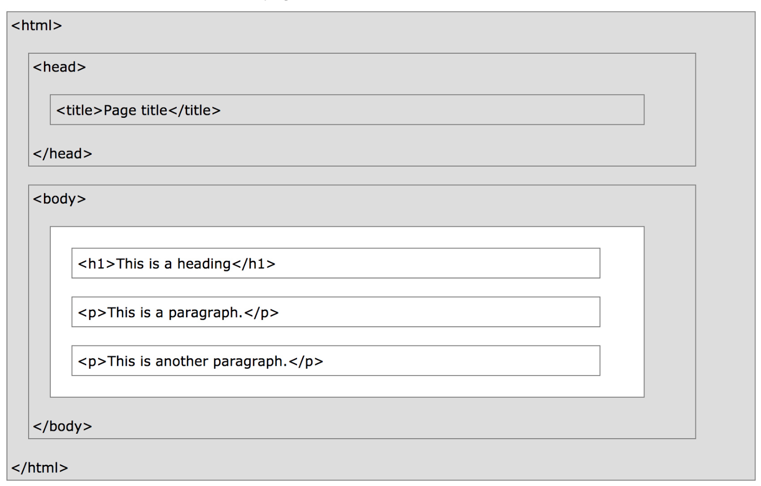
- Document Object Model (DOM): The internal representation of an HTML document as a hierarchical tree structure.

- Why do we care about the DOM? Extracting information out of an HTML document will involve traversing this tree.
- HTML element: An object in the DOM, such as a paragraph, header, or title.
- HTML tags: Markers that denote the start and end of an element, such as
<p>and</p>.
See the attached reference slides for examples of common tags.
- Attributes: Some tags have attributes, which further specify how to display information.
<p style="color: red">Look at my red text!</p>
- Often, the information we're looking for is nestled in one of these tags:
| Element | Description |
|---|---|
<html> |
the document |
<head> |
the header |
<body> |
the body |
<div> |
a logical division of the document |
<span> |
an inline logical division |
<p> |
a paragraph |
<a> |
an anchor (hyperlink) |
<h1>, <h2>, ... |
header(s) |
<img> |
an image |
- There are many, many more. See this article for examples.
- Tags can have attributes, which further specify how to display information on a webpage.
- For instance,
<img>tags havesrcandaltattributes, among others:
<img src="cool-visualization.png" alt="My box plot that I'm super proud of." width=500>
- Hyperlinks have
hrefattributes:
Click <a href="https://study.practicaldsc.org">this link</a> to access past exams.
- The
<div>tag is one of the more common tags. It defines a "section" of an HTML document, and is often used as a container for other HTML elements.
Think of<div>s like cells in Jupyter Notebooks.
<div class="background">
          <h3>This is a heading</h3>
          <p>This is a paragraph.</p>
        </div>
- Often, the information we're looking for is stored in an attribute!
You can imagine a situation where we want to get the URL behind a button, for example.
Question 🤔 (Answer at practicaldsc.org/q)
Remember that you can always ask questions anonymously at the link above!
What lingering questions do we have about the Document Object Model and the structure of HTML?
Parsing HTML
Beautiful Soup 🍜
- Beautiful Soup 4 is a Python HTML parser.
Remember, parse means to "extract meaning from a sequence of symbols".
- Warning: Beautiful Soup 4 and Beautiful Soup 3 work differently, so make sure you are using and looking at documentation for Beautiful Soup 4.
Rest assured, thepdsconda environment already has Beautiful Soup 4 installed.
Example HTML document
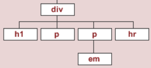
- To start, we'll work with the source code for an HTML page with the DOM tree shown below:
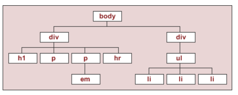
- This is the DOM tree of the HTML document
html_stringwe created earlier.
In [19]:
print(html_string)
<html>
    <body>
      <div id="content">
        <h1>Heading here</h1>
        <p>My First paragraph</p>
        <p>My <em>second</em> paragraph</p>
        <hr>
      </div>
      <div id="nav">
        <ul>
          <li>item 1</li>
          <li>item 2</li>
          <li>item 3</li>
        </ul>
      </div>
    </body>
</html>
In [20]:
HTML(html_string)
Out[20]:
Heading here
My First paragraph
My second paragraph
Instantiating BeautifulSoup objects
bs4'sBeautifulSoupfunction takes in a string or file-like object representing HTML and returns a parsed document.
In [21]:
# We also could have used:
# import bs4
# But, then we'd need to use bs4.BeautifulSoup every time.
from bs4 import BeautifulSoup
- Normally, we pass the result of a
GETrequest toBeautifulSoup, but here we will pass our hand-craftedhtml_string.
In [22]:
soup = BeautifulSoup(html_string)
soup
Out[22]:
<html>
<body>
<div id="content">
<h1>Heading here</h1>
<p>My First paragraph</p>
<p>My <em>second</em> paragraph</p>
<hr/>
</div>
<div id="nav">
<ul>
<li>item 1</li>
<li>item 2</li>
<li>item 3</li>
</ul>
</div>
</body>
</html>
In [23]:
type(soup)
Out[23]:
bs4.BeautifulSoup
BeautifulSoupobjects have several useful attributes, e.g.text:
In [24]:
print(soup.text)
Heading here
My First paragraph
My second paragraph


item 1
item 2
item 3
Finding elements in a BeautifulSoup object
- The two main methods you will use to extract information from a BeautifulSoup object are
findandfind_all.
soup.find(tag)finds the first instance of a tag (the first one on the page, i.e. the first one that DFS sees), and returns just that tag.
It has several optional arguments, including some that involve defininglambdafunctions: look at the documentation!
soup.find_all(tag)will find all instances of a tag, and returns a list of tags.
- Remember:
findfinds tags!
Using find
- Let's try and extract the first
<div>subtree.
 ⬇️
⬇️ 
In [25]:
soup.find('div')
Out[25]:
<div id="content">
<h1>Heading here</h1>
<p>My First paragraph</p>
<p>My <em>second</em> paragraph</p>
<hr/>
</div>
- Let's try and find the
<div>element that has anidattribute equal to'nav'.
In [26]:
soup.find('div', attrs={'id': 'nav'})
Out[26]:
<div id="nav">
<ul>
<li>item 1</li>
<li>item 2</li>
<li>item 3</li>
</ul>
</div>
findwill return the first occurrence of a tag, regardless of its depth in the tree.
In [27]:
# The ul child is not at the top of the tree, but we can still find it.
soup.find('ul')
Out[27]:
<ul>
<li>item 1</li>
<li>item 2</li>
<li>item 3</li>
</ul>
Using find_all
find_allreturns a list of all matching tags.
In [28]:
soup
Out[28]:
<html>
<body>
<div id="content">
<h1>Heading here</h1>
<p>My First paragraph</p>
<p>My <em>second</em> paragraph</p>
<hr/>
</div>
<div id="nav">
<ul>
<li>item 1</li>
<li>item 2</li>
<li>item 3</li>
</ul>
</div>
</body>
</html>
In [29]:
soup.find_all('div')
Out[29]:
[<div id="content">
 <h1>Heading here</h1>
 <p>My First paragraph</p>
 <p>My <em>second</em> paragraph</p>
 <hr/>
 </div>,
 <div id="nav">
 <ul>
 <li>item 1</li>
 <li>item 2</li>
 <li>item 3</li>
 </ul>
 </div>]
In [30]:
soup.find_all('li')
Out[30]:
[<li>item 1</li>, <li>item 2</li>, <li>item 3</li>]
- We often use the
find_allmethod in conjunction with afor-loop or list comprehension, to perform some operation on every matching tag.
In [31]:
[x.text for x in soup.find_all('li')]
Out[31]:
['item 1', 'item 2', 'item 3']
Node attributes
- The
textattribute of a tag element gets the text between the opening and closing tags.
In [32]:
soup.find('p')
Out[32]:
<p>My First paragraph</p>
In [33]:
soup.find('p').text
Out[33]:
'My First paragraph'
- The
attrsattribute of a tag element lists all of its attributes.
In [34]:
soup.find('div')
Out[34]:
<div id="content">
<h1>Heading here</h1>
<p>My First paragraph</p>
<p>My <em>second</em> paragraph</p>
<hr/>
</div>
In [35]:
soup.find('div').text
Out[35]:
'\nHeading here\nMy First paragraph\nMy second paragraph\n\n'
In [36]:
soup.find('div').attrs
Out[36]:
{'id': 'content'}
- The
getmethod of a tag element gets the value of an attribute.findandgetare easy to get confused, but you'll use them both a lot.
In [37]:
soup.find('div').get('id')
Out[37]:
'content'
- The
getmethod must be called directly on the node that contains the attribute you're looking for.
In [38]:
soup
Out[38]:
<html>
<body>
<div id="content">
<h1>Heading here</h1>
<p>My First paragraph</p>
<p>My <em>second</em> paragraph</p>
<hr/>
</div>
<div id="nav">
<ul>
<li>item 1</li>
<li>item 2</li>
<li>item 3</li>
</ul>
</div>
</body>
</html>
In [39]:
# While there are multiple 'id' attributes, none of them are in the <html> tag at the top.
soup.get('id')
In [40]:
soup.find('div').get('id')
Out[40]:
'content'
Activity
Consider the following HTML document, which represents a webpage containing the top few songs with the most streams on Spotify today in Canada.
<head>
    <title>3*Canada-2022-06-04</title>
</head>
<body>
    <h1>Spotify Top 3 - Canada</h1>
    <table>
        <tr class='heading'>
            <th>Rank</th>
            <th>Artist(s)</th>
            <th>Song</th>
        </tr>
        <tr class=1>
            <td>1</td>
            <td>Harry Styles</td>
            <td>As It Was</td>
        </tr>
        <tr class=2>
            <td>2</td>
            <td>Jack Harlow</td>
            <td>First Class</td>
        </tr>
        <tr class=3>
            <td>3</td>
            <td>Kendrick Lamar</td>
            <td>N95</td>
        </tr>
    </table>
</body>
- Part 1: How many leaf nodes are there in the DOM tree of the previous document — that is, how many nodes have no children?
- Part 2: What does the following line of code evaluate to?
len(soup.find_all("td"))
- Part 3: What does the following line of code evaluate to?
soup.find("tr").get("class")
Example: Scraping quotes 💬
Example: Scraping quotes
- Navigate to quotes.toscrape.com.
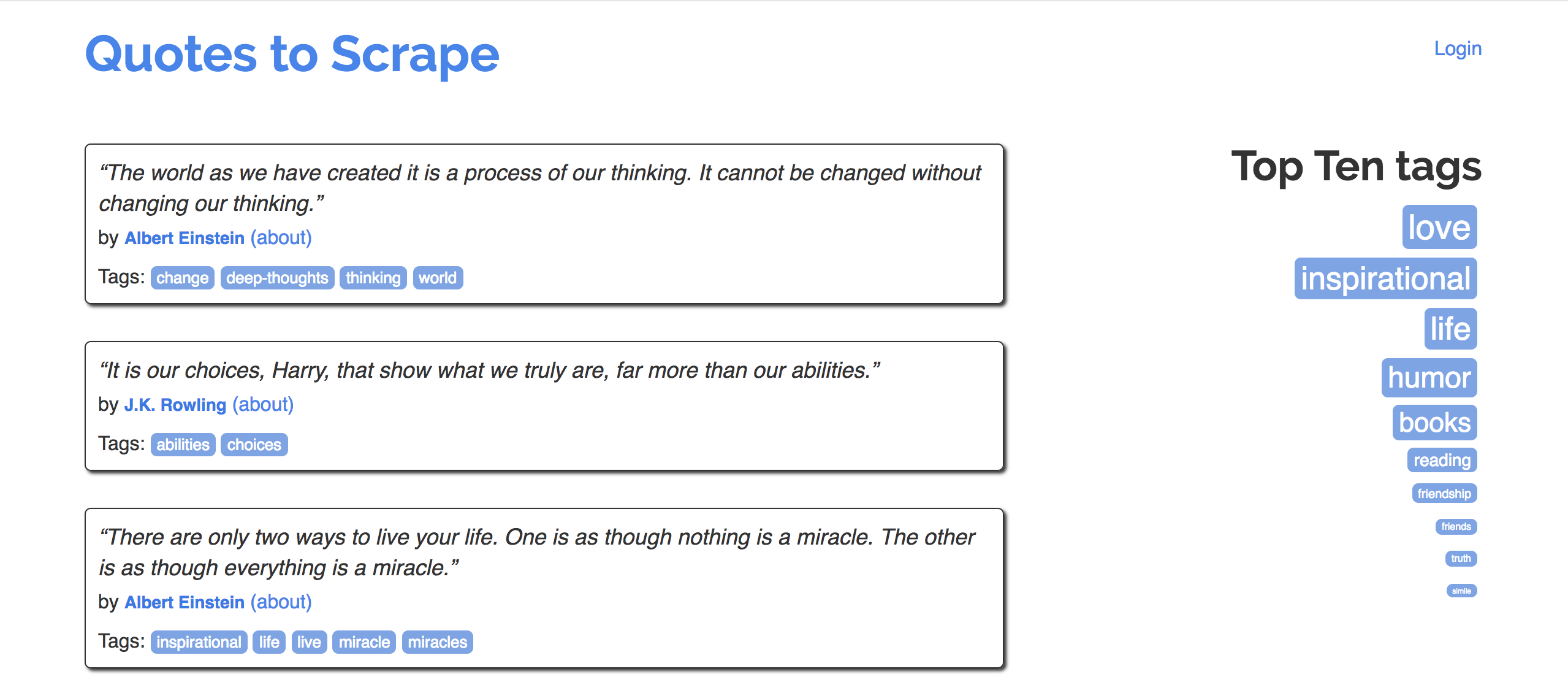
- Goal: Extract quotes, and relevant metadata, into a DataFrame.
- Specifically, let's try to make a DataFrame that looks like the one below:
| quote | author | author_url | tags | |
|---|---|---|---|---|
| 0 | “The world as we have created it is a process of our thinking. It cannot be changed without changing our thinking.” | Albert Einstein | https://quotes.toscrape.com/author/Albert-Einstein | change,deep-thoughts,thinking,world |
| 1 | “It is our choices, Harry, that show what we truly are, far more than our abilities.” | J.K. Rowling | https://quotes.toscrape.com/author/J-K-Rowling | abilities,choices |
| 2 | “There are only two ways to live your life. One is as though nothing is a miracle. The other is as though everything is a miracle.” | Albert Einstein | https://quotes.toscrape.com/author/Albert-Einstein | inspirational,life,live,miracle,miracles |
Organizing our work
- Eventually, we will implement a single function,
make_quote_df, which takes in an integernand returns a DataFrame with the quotes on the firstnpages of quotes.toscrape.com.
- Along the way, we'll implement several helper functions, with the goal of separating our logic: each function should either request information, OR parse, but not both!
- This makes it easier to debug and catch errors.
- It also avoids unnecessary requests.
Downloading a single page
- First, let's figure out how to download a single page from quotes.toscrape.com.
- The URLs seem to be formatted a very particular way:
https://quotes.toscrape.com/page/2
In [41]:
def download_page(i):
    url = f'https://quotes.toscrape.com/page/{i}'
    res = requests.get(url)
    return BeautifulSoup(res.text)
- Let's test our function on a single page, like Page 2.
There's nothing special about Page 2; we chose it arbitrarily.
In [42]:
soup = download_page(2)
soup
Out[42]:
<!DOCTYPE html>
<html lang="en">
<head>
<meta charset="utf-8"/>
<title>Quotes to Scrape</title>
<link href="/static/bootstrap.min.css" rel="stylesheet"/>
<link href="/static/main.css" rel="stylesheet"/>
</head>
<body>
<div class="container">
<div class="row header-box">
<div class="col-md-8">
<h1>
<a href="/" style="text-decoration: none">Quotes to Scrape</a>
</h1>
</div>
<div class="col-md-4">
<p>
<a href="/login">Login</a>
</p>
</div>
</div>
<div class="row">
<div class="col-md-8">
<div class="quote" itemscope="" itemtype="http://schema.org/CreativeWork">
<span class="text" itemprop="text">“This life is what you make it. No matter what, you're going to mess up sometimes, it's a universal truth. But the good part is you get to decide how you're going to mess it up. Girls will be your friends - they'll act like it anyway. But just remember, some come, some go. The ones that stay with you through everything - they're your true best friends. Don't let go of them. Also remember, sisters make the best friends in the world. As for lovers, well, they'll come and go too. And baby, I hate to say it, most of them - actually pretty much all of them are going to break your heart, but you can't give up because if you give up, you'll never find your soulmate. You'll never find that half who makes you whole and that goes for everything. Just because you fail once, doesn't mean you're gonna fail at everything. Keep trying, hold on, and always, always, always believe in yourself, because if you don't, then who will, sweetie? So keep your head high, keep your chin up, and most importantly, keep smiling, because life's a beautiful thing and there's so much to smile about.”</span>
<span>by <small class="author" itemprop="author">Marilyn Monroe</small>
<a href="/author/Marilyn-Monroe">(about)</a>
</span>
<div class="tags">
            Tags:
            <meta class="keywords" content="friends,heartbreak,inspirational,life,love,sisters" itemprop="keywords"/>
<a class="tag" href="/tag/friends/page/1/">friends</a>
<a class="tag" href="/tag/heartbreak/page/1/">heartbreak</a>
<a class="tag" href="/tag/inspirational/page/1/">inspirational</a>
<a class="tag" href="/tag/life/page/1/">life</a>
<a class="tag" href="/tag/love/page/1/">love</a>
<a class="tag" href="/tag/sisters/page/1/">sisters</a>
</div>
</div>
<div class="quote" itemscope="" itemtype="http://schema.org/CreativeWork">
<span class="text" itemprop="text">“It takes a great deal of bravery to stand up to our enemies, but just as much to stand up to our friends.”</span>
<span>by <small class="author" itemprop="author">J.K. Rowling</small>
<a href="/author/J-K-Rowling">(about)</a>
</span>
<div class="tags">
            Tags:
            <meta class="keywords" content="courage,friends" itemprop="keywords"/>
<a class="tag" href="/tag/courage/page/1/">courage</a>
<a class="tag" href="/tag/friends/page/1/">friends</a>
</div>
</div>
<div class="quote" itemscope="" itemtype="http://schema.org/CreativeWork">
<span class="text" itemprop="text">“If you can't explain it to a six year old, you don't understand it yourself.”</span>
<span>by <small class="author" itemprop="author">Albert Einstein</small>
<a href="/author/Albert-Einstein">(about)</a>
</span>
<div class="tags">
            Tags:
            <meta class="keywords" content="simplicity,understand" itemprop="keywords"/>
<a class="tag" href="/tag/simplicity/page/1/">simplicity</a>
<a class="tag" href="/tag/understand/page/1/">understand</a>
</div>
</div>
<div class="quote" itemscope="" itemtype="http://schema.org/CreativeWork">
<span class="text" itemprop="text">“You may not be her first, her last, or her only. She loved before she may love again. But if she loves you now, what else matters? She's not perfect—you aren't either, and the two of you may never be perfect together but if she can make you laugh, cause you to think twice, and admit to being human and making mistakes, hold onto her and give her the most you can. She may not be thinking about you every second of the day, but she will give you a part of her that she knows you can break—her heart. So don't hurt her, don't change her, don't analyze and don't expect more than she can give. Smile when she makes you happy, let her know when she makes you mad, and miss her when she's not there.”</span>
<span>by <small class="author" itemprop="author">Bob Marley</small>
<a href="/author/Bob-Marley">(about)</a>
</span>
<div class="tags">
            Tags:
            <meta class="keywords" content="love" itemprop="keywords"/>
<a class="tag" href="/tag/love/page/1/">love</a>
</div>
</div>
<div class="quote" itemscope="" itemtype="http://schema.org/CreativeWork">
<span class="text" itemprop="text">“I like nonsense, it wakes up the brain cells. Fantasy is a necessary ingredient in living.”</span>
<span>by <small class="author" itemprop="author">Dr. Seuss</small>
<a href="/author/Dr-Seuss">(about)</a>
</span>
<div class="tags">
            Tags:
            <meta class="keywords" content="fantasy" itemprop="keywords"/>
<a class="tag" href="/tag/fantasy/page/1/">fantasy</a>
</div>
</div>
<div class="quote" itemscope="" itemtype="http://schema.org/CreativeWork">
<span class="text" itemprop="text">“I may not have gone where I intended to go, but I think I have ended up where I needed to be.”</span>
<span>by <small class="author" itemprop="author">Douglas Adams</small>
<a href="/author/Douglas-Adams">(about)</a>
</span>
<div class="tags">
            Tags:
            <meta class="keywords" content="life,navigation" itemprop="keywords"/>
<a class="tag" href="/tag/life/page/1/">life</a>
<a class="tag" href="/tag/navigation/page/1/">navigation</a>
</div>
</div>
<div class="quote" itemscope="" itemtype="http://schema.org/CreativeWork">
<span class="text" itemprop="text">“The opposite of love is not hate, it's indifference. The opposite of art is not ugliness, it's indifference. The opposite of faith is not heresy, it's indifference. And the opposite of life is not death, it's indifference.”</span>
<span>by <small class="author" itemprop="author">Elie Wiesel</small>
<a href="/author/Elie-Wiesel">(about)</a>
</span>
<div class="tags">
            Tags:
            <meta class="keywords" content="activism,apathy,hate,indifference,inspirational,love,opposite,philosophy" itemprop="keywords"/>
<a class="tag" href="/tag/activism/page/1/">activism</a>
<a class="tag" href="/tag/apathy/page/1/">apathy</a>
<a class="tag" href="/tag/hate/page/1/">hate</a>
<a class="tag" href="/tag/indifference/page/1/">indifference</a>
<a class="tag" href="/tag/inspirational/page/1/">inspirational</a>
<a class="tag" href="/tag/love/page/1/">love</a>
<a class="tag" href="/tag/opposite/page/1/">opposite</a>
<a class="tag" href="/tag/philosophy/page/1/">philosophy</a>
</div>
</div>
<div class="quote" itemscope="" itemtype="http://schema.org/CreativeWork">
<span class="text" itemprop="text">“It is not a lack of love, but a lack of friendship that makes unhappy marriages.”</span>
<span>by <small class="author" itemprop="author">Friedrich Nietzsche</small>
<a href="/author/Friedrich-Nietzsche">(about)</a>
</span>
<div class="tags">
            Tags:
            <meta class="keywords" content="friendship,lack-of-friendship,lack-of-love,love,marriage,unhappy-marriage" itemprop="keywords"/>
<a class="tag" href="/tag/friendship/page/1/">friendship</a>
<a class="tag" href="/tag/lack-of-friendship/page/1/">lack-of-friendship</a>
<a class="tag" href="/tag/lack-of-love/page/1/">lack-of-love</a>
<a class="tag" href="/tag/love/page/1/">love</a>
<a class="tag" href="/tag/marriage/page/1/">marriage</a>
<a class="tag" href="/tag/unhappy-marriage/page/1/">unhappy-marriage</a>
</div>
</div>
<div class="quote" itemscope="" itemtype="http://schema.org/CreativeWork">
<span class="text" itemprop="text">“Good friends, good books, and a sleepy conscience: this is the ideal life.”</span>
<span>by <small class="author" itemprop="author">Mark Twain</small>
<a href="/author/Mark-Twain">(about)</a>
</span>
<div class="tags">
            Tags:
            <meta class="keywords" content="books,contentment,friends,friendship,life" itemprop="keywords"/>
<a class="tag" href="/tag/books/page/1/">books</a>
<a class="tag" href="/tag/contentment/page/1/">contentment</a>
<a class="tag" href="/tag/friends/page/1/">friends</a>
<a class="tag" href="/tag/friendship/page/1/">friendship</a>
<a class="tag" href="/tag/life/page/1/">life</a>
</div>
</div>
<div class="quote" itemscope="" itemtype="http://schema.org/CreativeWork">
<span class="text" itemprop="text">“Life is what happens to us while we are making other plans.”</span>
<span>by <small class="author" itemprop="author">Allen Saunders</small>
<a href="/author/Allen-Saunders">(about)</a>
</span>
<div class="tags">
            Tags:
            <meta class="keywords" content="fate,life,misattributed-john-lennon,planning,plans" itemprop="keywords"/>
<a class="tag" href="/tag/fate/page/1/">fate</a>
<a class="tag" href="/tag/life/page/1/">life</a>
<a class="tag" href="/tag/misattributed-john-lennon/page/1/">misattributed-john-lennon</a>
<a class="tag" href="/tag/planning/page/1/">planning</a>
<a class="tag" href="/tag/plans/page/1/">plans</a>
</div>
</div>
<nav>
<ul class="pager">
<li class="previous">
<a href="/page/1/"><span aria-hidden="true">←</span> Previous</a>
</li>
<li class="next">
<a href="/page/3/">Next <span aria-hidden="true">→</span></a>
</li>
</ul>
</nav>
</div>
<div class="col-md-4 tags-box">
<h2>Top Ten tags</h2>
<span class="tag-item">
<a class="tag" href="/tag/love/" style="font-size: 28px">love</a>
</span>
<span class="tag-item">
<a class="tag" href="/tag/inspirational/" style="font-size: 26px">inspirational</a>
</span>
<span class="tag-item">
<a class="tag" href="/tag/life/" style="font-size: 26px">life</a>
</span>
<span class="tag-item">
<a class="tag" href="/tag/humor/" style="font-size: 24px">humor</a>
</span>
<span class="tag-item">
<a class="tag" href="/tag/books/" style="font-size: 22px">books</a>
</span>
<span class="tag-item">
<a class="tag" href="/tag/reading/" style="font-size: 14px">reading</a>
</span>
<span class="tag-item">
<a class="tag" href="/tag/friendship/" style="font-size: 10px">friendship</a>
</span>
<span class="tag-item">
<a class="tag" href="/tag/friends/" style="font-size: 8px">friends</a>
</span>
<span class="tag-item">
<a class="tag" href="/tag/truth/" style="font-size: 8px">truth</a>
</span>
<span class="tag-item">
<a class="tag" href="/tag/simile/" style="font-size: 6px">simile</a>
</span>
</div>
</div>
</div>
<footer class="footer">
<div class="container">
<p class="text-muted">
                Quotes by: <a href="https://www.goodreads.com/quotes">GoodReads.com</a>
</p>
<p class="copyright">
                Made with <span class="zyte">❤</span> by <a class="zyte" href="https://www.zyte.com">Zyte</a>
</p>
</div>
</footer>
</body>
</html>
- Now that this works, later on, we can call
download_page(1),download_page(2),download_page(3), ...,download_page(n).
Parsing a single page
- Now, let's try and extract the relevant information out of the
soupobject for Page 2.
- Open quotes.toscrape.com/page/2 in Chrome, right click the page, and click "Inspect"!
This will help us find where each quote is located in the HTML.
In [43]:
divs = soup.find_all('div', class_='quote')
# The above is a shortcut for the following, just for when the attribute key is class:
# divs = soup.find_all('div', attrs={'class': 'quote'})
In [44]:
divs[0]
Out[44]:
<div class="quote" itemscope="" itemtype="http://schema.org/CreativeWork">
<span class="text" itemprop="text">“This life is what you make it. No matter what, you're going to mess up sometimes, it's a universal truth. But the good part is you get to decide how you're going to mess it up. Girls will be your friends - they'll act like it anyway. But just remember, some come, some go. The ones that stay with you through everything - they're your true best friends. Don't let go of them. Also remember, sisters make the best friends in the world. As for lovers, well, they'll come and go too. And baby, I hate to say it, most of them - actually pretty much all of them are going to break your heart, but you can't give up because if you give up, you'll never find your soulmate. You'll never find that half who makes you whole and that goes for everything. Just because you fail once, doesn't mean you're gonna fail at everything. Keep trying, hold on, and always, always, always believe in yourself, because if you don't, then who will, sweetie? So keep your head high, keep your chin up, and most importantly, keep smiling, because life's a beautiful thing and there's so much to smile about.”</span>
<span>by <small class="author" itemprop="author">Marilyn Monroe</small>
<a href="/author/Marilyn-Monroe">(about)</a>
</span>
<div class="tags">
            Tags:
            <meta class="keywords" content="friends,heartbreak,inspirational,life,love,sisters" itemprop="keywords"/>
<a class="tag" href="/tag/friends/page/1/">friends</a>
<a class="tag" href="/tag/heartbreak/page/1/">heartbreak</a>
<a class="tag" href="/tag/inspirational/page/1/">inspirational</a>
<a class="tag" href="/tag/life/page/1/">life</a>
<a class="tag" href="/tag/love/page/1/">love</a>
<a class="tag" href="/tag/sisters/page/1/">sisters</a>
</div>
</div>
- From this
<div>, we can extract the quote, author name, author's URL, and tags.
Strategy: Figure out how to process one<div>, then put that logic in a function to use on other<div>s.
In [45]:
# The quote.
divs[0].find('span', class_='text').text
Out[45]:
"“This life is what you make it. No matter what, you're going to mess up sometimes, it's a universal truth. But the good part is you get to decide how you're going to mess it up. Girls will be your friends - they'll act like it anyway. But just remember, some come, some go. The ones that stay with you through everything - they're your true best friends. Don't let go of them. Also remember, sisters make the best friends in the world. As for lovers, well, they'll come and go too. And baby, I hate to say it, most of them - actually pretty much all of them are going to break your heart, but you can't give up because if you give up, you'll never find your soulmate. You'll never find that half who makes you whole and that goes for everything. Just because you fail once, doesn't mean you're gonna fail at everything. Keep trying, hold on, and always, always, always believe in yourself, because if you don't, then who will, sweetie? So keep your head high, keep your chin up, and most importantly, keep smiling, because life's a beautiful thing and there's so much to smile about.”"
In [46]:
# The author.
divs[0].find('small', class_='author').text
Out[46]:
'Marilyn Monroe'
In [47]:
# The URL for the author.
divs[0].find('a').get('href')
Out[47]:
'/author/Marilyn-Monroe'
In [48]:
# The quote's tags.
divs[0].find('meta', class_='keywords').get('content')
Out[48]:
'friends,heartbreak,inspirational,life,love,sisters'
Parsing a single quote, and then a single page
- Let's implement a function that takes in a
<div>corresponding to a single quote and returns a dictionary containing the quote's information.
Why use a dictionary? Passingpd.DataFramea list of dictionaries is an easy way to create a DataFrame.
In [49]:
def process_quote(div):
    quote = div.find('span', class_='text').text
    author = div.find('small', class_='author').text
    author_url = 'https://quotes.toscrape.com' + div.find('a').get('href')
    tags = div.find('meta', class_='keywords').get('content')
    return {'quote': quote, 'author': author, 'author_url': author_url, 'tags': tags}
In [50]:
# Make sure everything here looks correct based on what's on the webpage!
process_quote(divs[4])
Out[50]:
{'quote': '“I like nonsense, it wakes up the brain cells. Fantasy is a necessary ingredient in living.”',
 'author': 'Dr. Seuss',
 'author_url': 'https://quotes.toscrape.com/author/Dr-Seuss',
 'tags': 'fantasy'}
- Now, we can implement a function that takes in a list of
<div>s, callsprocess_quoteon each<div>in the list, and returns a DataFrame.
In [51]:
def process_page(divs):
    return pd.DataFrame([process_quote(div) for div in divs])
In [52]:
process_page(divs)
Out[52]:
| quote | author | author_url | tags | |
|---|---|---|---|---|
| 0 | “This life is what you make it. No matter what... | Marilyn Monroe | https://quotes.toscrape.com/author/Marilyn-Monroe | friends,heartbreak,inspirational,life,love,sis... |
| 1 | “It takes a great deal of bravery to stand up ... | J.K. Rowling | https://quotes.toscrape.com/author/J-K-Rowling | courage,friends |
| 2 | “If you can't explain it to a six year old, yo... | Albert Einstein | https://quotes.toscrape.com/author/Albert-Eins... | simplicity,understand |
| ... | ... | ... | ... | ... |
| 7 | “It is not a lack of love, but a lack of frien... | Friedrich Nietzsche | https://quotes.toscrape.com/author/Friedrich-N... | friendship,lack-of-friendship,lack-of-love,lov... |
| 8 | “Good friends, good books, and a sleepy consci... | Mark Twain | https://quotes.toscrape.com/author/Mark-Twain | books,contentment,friends,friendship,life |
| 9 | “Life is what happens to us while we are makin... | Allen Saunders | https://quotes.toscrape.com/author/Allen-Saunders | fate,life,misattributed-john-lennon,planning,p... |
10 rows × 4 columns
Putting it all together
- Now, we can implement
make_quote_df.
In [53]:
def make_quote_df(n):
    '''Returns a DataFrame containing the quotes on the first n pages of https://quotes.toscrape.com/.''' # This is called a docstring!
    dfs = []
    for i in range(1, n+1):
        # Download page n and create a BeautifulSoup object.
        soup = download_page(i)
        # Create DataFrame using the information in that page.
        divs = soup.find_all('div', class_='quote')
        df = process_page(divs)
        # Append DataFrame to dfs.
        dfs.append(df)
    # Stitch all DataFrames together.
    return pd.concat(dfs).reset_index(drop=True)
In [54]:
quotes = make_quote_df(3)
quotes.head()
Out[54]:
| quote | author | author_url | tags | |
|---|---|---|---|---|
| 0 | “The world as we have created it is a process ... | Albert Einstein | https://quotes.toscrape.com/author/Albert-Eins... | change,deep-thoughts,thinking,world |
| 1 | “It is our choices, Harry, that show what we t... | J.K. Rowling | https://quotes.toscrape.com/author/J-K-Rowling | abilities,choices |
| 2 | “There are only two ways to live your life. On... | Albert Einstein | https://quotes.toscrape.com/author/Albert-Eins... | inspirational,life,live,miracle,miracles |
| 3 | “The person, be it gentleman or lady, who has ... | Jane Austen | https://quotes.toscrape.com/author/Jane-Austen | aliteracy,books,classic,humor |
| 4 | “Imperfection is beauty, madness is genius and... | Marilyn Monroe | https://quotes.toscrape.com/author/Marilyn-Monroe | be-yourself,inspirational |
- Now,
quotesis s DataFrame, like any other!
In [55]:
quotes['author'].value_counts().iloc[:10].sort_values().plot(kind='barh')
- Implement
download_page(i), which downloads a single page (pagei) and returns aBeautifulSoupobject of the response.
- Implement
process_quote(div), which takes in a<div>tree corresponding to a single quote and returns a dictionary containing all of the relevant information for that quote.
- Implement
process_page(divs), which takes in a list of<div>trees corresponding to a single page and returns a DataFrame containing all of the relevant information for all quotes on that page.
- Implement
make_quote_df(n).
APIs and JSON
Recall, scraping was one of the ways to access data from the internet. APIs are the other way.
Application programing interface (API) terminology
- A URL, or uniform resource locator, describes the location of a website or resource.
- API requests are
GET/POSTrequests to a specially maintained URLs.
- As an example, we'll look at the Pokémon API.
- All requests are made to:
https://pokeapi.co/api/v2/{endpoint}/{name}
For example, to learn about Pikachu, we use the
pokemonendpoint with namepikachu.https://pokeapi.co/api/v2/pokemon/pikachu
Or, to learn about all water Pokemon, we use the
typeendpoint with namewater.https://pokeapi.co/api/v2/pokemon/pikachu
Example: Pokémon API ⚡️
- To illustrate, let's make a
GETrequest to learn more about Pikachu.
In [56]:
def request_pokemon(name):
    url = f'https://pokeapi.co/api/v2/pokemon/{name}'
    return requests.get(url)
res = request_pokemon('pikachu')
res
Out[56]:
<Response [200]>
- Remember, the 200 status code is good! Let's take a look at the text, the same way we did before:
In [57]:
res.text[:1000]
Out[57]:
'{"abilities":[{"ability":{"name":"static","url":"https://pokeapi.co/api/v2/ability/9/"},"is_hidden":false,"slot":1},{"ability":{"name":"lightning-rod","url":"https://pokeapi.co/api/v2/ability/31/"},"is_hidden":true,"slot":3}],"base_experience":112,"cries":{"latest":"https://raw.githubusercontent.com/PokeAPI/cries/main/cries/pokemon/latest/25.ogg","legacy":"https://raw.githubusercontent.com/PokeAPI/cries/main/cries/pokemon/legacy/25.ogg"},"forms":[{"name":"pikachu","url":"https://pokeapi.co/api/v2/pokemon-form/25/"}],"game_indices":[{"game_index":84,"version":{"name":"red","url":"https://pokeapi.co/api/v2/version/1/"}},{"game_index":84,"version":{"name":"blue","url":"https://pokeapi.co/api/v2/version/2/"}},{"game_index":84,"version":{"name":"yellow","url":"https://pokeapi.co/api/v2/version/3/"}},{"game_index":25,"version":{"name":"gold","url":"https://pokeapi.co/api/v2/version/4/"}},{"game_index":25,"version":{"name":"silver","url":"https://pokeapi.co/api/v2/version/5/"}},{"game_index":'
- Unlike when we were scraping earlier, the text in the response no longer resembles HTML!

JSON
- JSON stands for JavaScript Object Notation. It is a lightweight format for storing and transferring data.
- It is:
- very easy for computers to read and write.
- moderately easy for programmers to read and write by hand.
- meant to be generated and parsed.
- Most modern languages have an interface for working with JSON objects.
JSON objects resemble Python dictionaries, but are not the same!
JSON data types
| Type | Description |
|---|---|
| String | Anything inside double quotes. |
| Number | Any number (no difference between ints and floats). |
| Boolean | true and false. |
| Null | JSON's empty value, denoted by null. |
| Array | Like Python lists. |
| Object | A collection of key-value pairs, like dictionaries. Keys must be strings, values can be anything (even other objects). |
Example JSON object
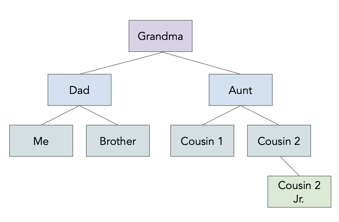 See
See data/family.json.In [58]:
!cat data/family.json
{
    "name": "Grandma",
    "age": 94,
    "children": [
        {
        "name": "Dad",
        "age": 60,
        "children": [{"name": "Me", "age": 24},
                     {"name": "Brother", "age": 22}]
        },
        {
        "name": "My Aunt",
        "children": [{"name": "Cousin 1", "age": 34},
                     {"name": "Cousin 2", "age": 36, "children":
                        [{"name": "Cousin 2 Jr.", "age": 2}]
                     }
                    ]
        }
    ]
}
In [59]:
import json
with open('data/family.json', 'r') as f:
    family_str = f.read()
    family_tree = json.loads(family_str) # loads stands for load string.
In [60]:
family_tree
Out[60]:
{'name': 'Grandma',
 'age': 94,
 'children': [{'name': 'Dad',
   'age': 60,
   'children': [{'name': 'Me', 'age': 24}, {'name': 'Brother', 'age': 22}]},
  {'name': 'My Aunt',
   'children': [{'name': 'Cousin 1', 'age': 34},
    {'name': 'Cousin 2',
     'age': 36,
     'children': [{'name': 'Cousin 2 Jr.', 'age': 2}]}]}]}
In [61]:
family_tree['children'][1]['children'][0]['age']
Out[61]:
34
json.load(f)loads a JSON file from a file object.
json.loads(f)loads a JSON file from a string.
In [62]:
with open('data/family.json') as f:
    family_tree = json.load(f)
family_tree
Out[62]:
{'name': 'Grandma',
 'age': 94,
 'children': [{'name': 'Dad',
   'age': 60,
   'children': [{'name': 'Me', 'age': 24}, {'name': 'Brother', 'age': 22}]},
  {'name': 'My Aunt',
   'children': [{'name': 'Cousin 1', 'age': 34},
    {'name': 'Cousin 2',
     'age': 36,
     'children': [{'name': 'Cousin 2 Jr.', 'age': 2}]}]}]}
In [63]:
with open('data/family.json') as f:
    family_tree_string = f.read()
    family_tree = json.loads(family_tree_string)
family_tree
Out[63]:
{'name': 'Grandma',
 'age': 94,
 'children': [{'name': 'Dad',
   'age': 60,
   'children': [{'name': 'Me', 'age': 24}, {'name': 'Brother', 'age': 22}]},
  {'name': 'My Aunt',
   'children': [{'name': 'Cousin 1', 'age': 34},
    {'name': 'Cousin 2',
     'age': 36,
     'children': [{'name': 'Cousin 2 Jr.', 'age': 2}]}]}]}
pandasalso has a built-inread_jsonfunction.
In [64]:
with open('data/family.json', 'r') as f:
    family_df = pd.read_json(f)
family_df
Out[64]:
| name | age | children | |
|---|---|---|---|
| 0 | Grandma | 94 | {'name': 'Dad', 'age': 60, 'children': [{'name... |
| 1 | Grandma | 94 | {'name': 'My Aunt', 'children': [{'name': 'Cou... |
- It only makes sense to use it, though, when you have a JSON file that has some sort of tabular structure. Our family tree example does not.
Example: Pokémon API ⚡️
- The response we get back from the Pokémon API looks like JSON.
We can extract the JSON from this request with thejsonmethod ofres.
We could also passres.texttojson.loads.
In [65]:
res = request_pokemon('pikachu')
res.text[:1000]
Out[65]:
'{"abilities":[{"ability":{"name":"static","url":"https://pokeapi.co/api/v2/ability/9/"},"is_hidden":false,"slot":1},{"ability":{"name":"lightning-rod","url":"https://pokeapi.co/api/v2/ability/31/"},"is_hidden":true,"slot":3}],"base_experience":112,"cries":{"latest":"https://raw.githubusercontent.com/PokeAPI/cries/main/cries/pokemon/latest/25.ogg","legacy":"https://raw.githubusercontent.com/PokeAPI/cries/main/cries/pokemon/legacy/25.ogg"},"forms":[{"name":"pikachu","url":"https://pokeapi.co/api/v2/pokemon-form/25/"}],"game_indices":[{"game_index":84,"version":{"name":"red","url":"https://pokeapi.co/api/v2/version/1/"}},{"game_index":84,"version":{"name":"blue","url":"https://pokeapi.co/api/v2/version/2/"}},{"game_index":84,"version":{"name":"yellow","url":"https://pokeapi.co/api/v2/version/3/"}},{"game_index":25,"version":{"name":"gold","url":"https://pokeapi.co/api/v2/version/4/"}},{"game_index":25,"version":{"name":"silver","url":"https://pokeapi.co/api/v2/version/5/"}},{"game_index":'
In [66]:
pikachu = res.json()
pikachu
Out[66]:
In [67]:
pikachu.keys()
Out[67]:
dict_keys(['abilities', 'base_experience', 'cries', 'forms', 'game_indices', 'height', 'held_items', 'id', 'is_default', 'location_area_encounters', 'moves', 'name', 'order', 'past_abilities', 'past_types', 'species', 'sprites', 'stats', 'types', 'weight'])
In [68]:
pikachu['weight']
Out[68]:
60
In [69]:
pikachu['abilities'][1]['ability']['name']
Out[69]:
'lightning-rod'
Invalid GET requests
- Let's try a
GETrequest for'wolverine'.
In [70]:
request_pokemon('wolverine')
Out[70]:
<Response [404]>
- We receive a 404 error, since there is no Pokémon named
'wolverine'!
More on APIs
- We accessed the Pokémon API by making requests. But, some APIs exist as Python wrappers, which allow you to make requests by calling Python functions.
request_pokemonis essentially a wrapper for (a small part of) the Pokémon API. If you're curious, try out the DeepSeek API!
- Some APIs will require you to create an API key, and send that key as part of your request.
See Homework 5 for an example!
- Many of the APIs you'll use are "REST" APIs. Learn more about RESTful APIs here.
REST stands for "Representational State Transfer." One of the key properties of a RESTful API is that servers don't store any information about previous requests, or who is making them.
Summary, next time
- Beautiful Soup is an HTML parser that allows us to (somewhat) easily extract information from HTML documents.
soup.findandsoup.find_allare the methods you will use most often.
- When writing scraping code:
- Use "inspect element" to identify the names of tags and attributes that are relevant to the information you want to extract.
- Separate your logic for making requests and for parsing.