from lec_utils import *
Lecture 7
EDA, Visualization, and Missing Value Imputation
EECS 398: Practical Data Science, Spring 2025
practicaldsc.org • github.com/practicaldsc/sp25 • 📣 See latest announcements here on Ed
Agenda 📆
- Exploratory data analysis 🔎.
- Visualization 📊.
- Missing value imputation 🕳️.
There's a Visualization Tips and Examples guide linked on the course website that supplements this lecture. Make sure to read it!
Question 🤔 (Answer at practicaldsc.org/q)
Remember that you can always ask questions anonymously at the link above!
How long does Homework 3 feel compared to Homework 2?
- A. Way shorter.
- B. Shorter.
- C. About the same.
- D. Longer.
- E. Way longer.
Exploratory data analysis 🔎
Loading the data 🏦
- Recall from last class, LendingClub is a platform that allows individuals to borrow money – that is, take on loans.
- Each row of our dataset contains information about a loan holder, i.e. someone who was already approved for a loan.
# Run this cell to perform the data cleaning steps we implemented last lecture.
def clean_term_column(df):
    return df.assign(
        term=df['term'].str.split().str[0].astype(int)
    )
def clean_date_column(df):
    return (
        df
        .assign(date=pd.to_datetime(df['issue_d'], format='%b-%Y'))
        .drop(columns=['issue_d'])
    )
loans = (
    pd.read_csv('data/loans.csv')
    .pipe(clean_term_column)
    .pipe(clean_date_column)
)
loans
| id | loan_amnt | term | int_rate | ... | fico_range_high | hardship_flag | mths_since_last_delinq | date | |
|---|---|---|---|---|---|---|---|---|---|
| 0 | 17965023 | 18000.0 | 60 | 16.99 | ... | 704.0 | N | 72.0 | 2014-06-01 |
| 1 | 111414087 | 10000.0 | 36 | 16.02 | ... | 684.0 | N | 6.0 | 2017-06-01 |
| 2 | 95219557 | 12800.0 | 36 | 7.99 | ... | 709.0 | N | 66.0 | 2016-12-01 |
| ... | ... | ... | ... | ... | ... | ... | ... | ... | ... |
| 6297 | 63990101 | 10800.0 | 60 | 18.49 | ... | 679.0 | N | 39.0 | 2015-11-01 |
| 6298 | 37641672 | 15000.0 | 60 | 14.31 | ... | 664.0 | N | 22.0 | 2014-12-01 |
| 6299 | 50587446 | 14000.0 | 60 | 9.99 | ... | 689.0 | N | NaN | 2015-06-01 |
6300 rows × 20 columns
Lender decision-making
- Larger interest rates make the loan more expensive for the borrower – as a borrower, you want a lower interest rate!
- Even for the same loan amount, different borrowers were approved for different terms and interest rates:
display_df(loans.loc[loans['loan_amnt'] == 3600, ['loan_amnt', 'term', 'int_rate']], rows=17)
| loan_amnt | term | int_rate | |
|---|---|---|---|
| 249 | 3600.0 | 36 | 24.50 |
| 626 | 3600.0 | 36 | 13.99 |
| 1020 | 3600.0 | 36 | 11.49 |
| 2141 | 3600.0 | 36 | 10.08 |
| 2145 | 3600.0 | 36 | 5.32 |
| 2584 | 3600.0 | 36 | 16.29 |
| 2739 | 3600.0 | 36 | 8.24 |
| 3845 | 3600.0 | 36 | 13.66 |
| 4153 | 3600.0 | 36 | 12.59 |
| 4368 | 3600.0 | 36 | 14.08 |
| 4575 | 3600.0 | 36 | 16.46 |
| 4959 | 3600.0 | 36 | 10.75 |
| 4984 | 3600.0 | 36 | 13.99 |
| 5478 | 3600.0 | 60 | 10.59 |
| 5560 | 3600.0 | 36 | 19.99 |
| 5693 | 3600.0 | 36 | 13.99 |
| 6113 | 3600.0 | 36 | 15.59 |
- Why do different borrowers receive different terms and interest rates?
Exploratory data analysis (EDA)
- Historically, data analysis was dominated by formal statistics, including tools like confidence intervals, hypothesis tests, and statistical modeling.
In 1977, John Tukey defined the term exploratory data analysis, which described a philosophy for proceeding about data analysis:
Exploratory data analysis is actively incisive, rather than passively descriptive, with real emphasis on the discovery of the unexpected.
Practically, EDA involves, among other things, computing summary statistics and drawing plots to understand the nature of the data at hand.
The greatest gains from data come from surprises… The unexpected is best brought to our attention by pictures.
- Today, we'll learn how to ask questions, visualize, and deal with missing values.
Individuals and features
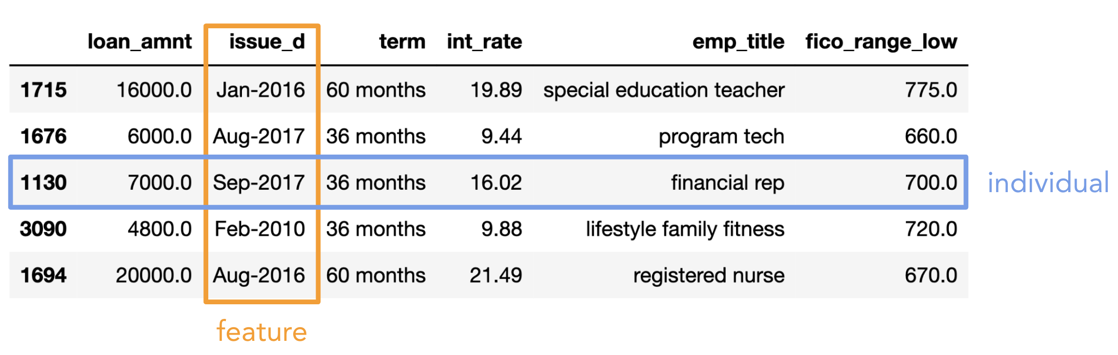
- Individual (row): Person/place/thing for which data is recorded. Also called an observation.
- Feature (column): Something that is recorded for each individual. Also called a variable or attribute.
Here, "variable" doesn't mean Python variable!
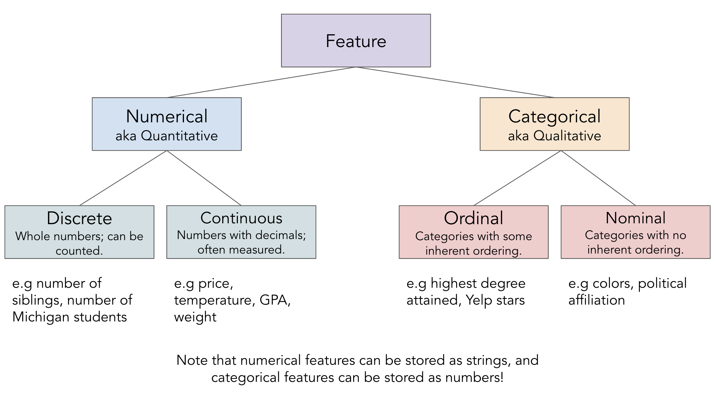
- There are two key types of features:
- Numerical features: It makes sense to do arithmetic with the values.
- Categorical features: Values fall into categories, that may or may not have some order to them.
- Be careful: sometimes numerical features are stored as strings, and categorical features are stored as numbers.
The transformations we discussed last class can help fix these issues.
Feature types
Asking questions 🙋
- EDA involves asking questions about the data without any preconceived notions of what the answers may be.
- With practice, you'll learn which questions to ask; we'll demonstrate some of that here.
Who do we have data for?
- We were told that we're only looking at approved loans. What's the distribution of
'loan_status'es?
loans.columns
Index(['id', 'loan_amnt', 'term', 'int_rate', 'grade', 'sub_grade',
       'emp_title', 'verification_status', 'home_ownership', 'annual_inc',
       'loan_status', 'purpose', 'desc', 'addr_state', 'dti', 'fico_range_low',
       'fico_range_high', 'hardship_flag', 'mths_since_last_delinq', 'date'],
      dtype='object')
loans['loan_status'].value_counts()
loan_status
Fully Paid                                            3025
Current                                               2367
Charged Off                                            814
Late (31-120 days)                                      59
In Grace Period                                         23
Late (16-30 days)                                       11
Does not meet the credit policy. Status:Fully Paid       1
Name: count, dtype: int64
- Are the loans in our dataset specific to any particular state?
loans['addr_state'].value_counts().head()
addr_state
CA    905
TX    553
NY    498
FL    420
IL    261
Name: count, dtype: int64
What is the distribution of loan amounts?
loans['loan_amnt'].describe()
count     6300.00
mean     15568.80
std       7398.97
           ...
50%      15000.00
75%      19125.00
max      40000.00
Name: loan_amnt, Length: 8, dtype: float64
loans['loan_amnt'].plot(kind='hist', nbins=10)
Are related features in agreement?
- Why are there two columns with credit scores,
'fico_range_low'and'fico_range_high'? What do they both mean?
loans[['fico_range_low', 'fico_range_high']]
| fico_range_low | fico_range_high | |
|---|---|---|
| 0 | 700.0 | 704.0 |
| 1 | 680.0 | 684.0 |
| 2 | 705.0 | 709.0 |
| ... | ... | ... |
| 6297 | 675.0 | 679.0 |
| 6298 | 660.0 | 664.0 |
| 6299 | 685.0 | 689.0 |
6300 rows × 2 columns
(loans['fico_range_high'] - loans['fico_range_low']).value_counts()
4.0    6298
5.0       2
Name: count, dtype: int64
- Does every
'sub_grade'align with its related'grade'?
loans[['grade', 'sub_grade']]
| grade | sub_grade | |
|---|---|---|
| 0 | D | D3 |
| 1 | C | C5 |
| 2 | A | A5 |
| ... | ... | ... |
| 6297 | E | E2 |
| 6298 | C | C4 |
| 6299 | B | B3 |
6300 rows × 2 columns
# Turns out, the answer is yes!
# The .str accessor allows us to use the [0] operation
# on every string in loans['sub_grade'].
(loans['sub_grade'].str[0] == loans['grade']).all()
True
Visualization 📊
Why visualize?
- In this lecture, we will create several visualizations using just a single dataset.
- The visualizations we want to create will often dictate the data cleaning steps we take.
For example, we can't plot the average interest rate over time without converting dates to timestamp objects!
- One reason to create visualizations is for us to better understand our data.
- Another reason is to accurately communicate a message to other people!
plotly
- We've used
plotlyin lecture briefly, and you've even used it in Homework 1 and Homework 3, but we've never formally discussed it.
- It's a visualization library that enables interactive visualizations.

- We can use
plotlyusing theplotly.expresssyntax.plotlyis very flexible but it can be verbose;plotly.expressallows us to make plots quickly.- See the documentation here – it's very rich.
There are good examples for almost everything!
import plotly.express as px
- Alternatively, we can use
plotlyby settingpandasplotting backend to'plotly'and using the DataFrame/Seriesplotmethod.
By default, the plotting backend ismatplotlib, which creates non-interactive visualizations.
pd.options.plotting.backend = 'plotly'
Choosing the correct type of visualization
- The type of visualization we create depends on the types of features we're visualizing.
- We'll directly learn how to produce the bolded visualizations below, but the others are also options.
See more examples of visualization types here.
| Feature types | Options |
|---|---|
| Single categorical feature | Bar charts, pie charts, dot plots |
| Single numerical feature | Histograms, box plots, density curves, rug plots, violin plots |
| Two numerical features | Scatter plots, line plots, heat maps, contour plots |
| One categorical and one numerical feature It really depends on the nature of the features themselves! |
Side-by-side histograms, box plots, or bar charts, overlaid line plots or density curves |
- Note that we use the words "plot", "chart", and "graph" to mean the same thing.
- Now, we're going to look at several examples. Focus on what is being visualized and why; read the notebook later for the how.
Bar charts
- Bar charts are used to show:
- The distribution of a single categorical feature, or
- The relationship between one categorical feature and one numerical feature.
- Usage:
px.bar/px.barhordf.plot(kind='bar')/df.plot(kind='barh').'h'stands for "horizontal."
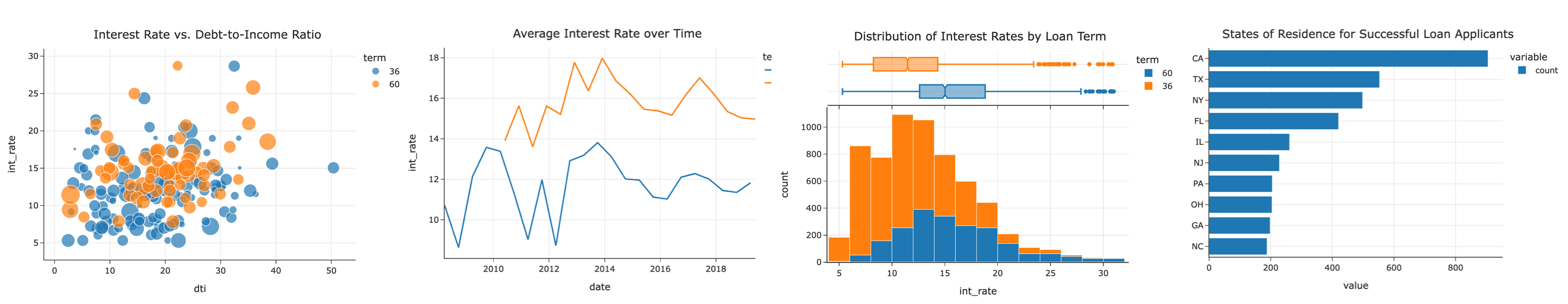
- Example: What is the distribution of
'addr_state's inloans?
# Here, we're using the .plot method on loans['addr_state'], which is a Series.
# We prefer horizontal bar charts, since they're easier to read.
(
    loans['addr_state']
    .value_counts()
    .plot(kind='barh')
)
# A little formatting goes a long way!
(
    loans['addr_state']
    .value_counts(normalize=True)
    .head(10)
    .sort_values()
    .plot(kind='barh', title='States of Residence for Successful Loan Applicants')
)
- Example: What is the average
'int_rate'for each'home_ownership'status?
(
    loans
    .groupby('home_ownership')
    ['int_rate']
    .mean()
    .plot(kind='barh', title='Average Interest Rate by Home Ownership Status')
)
# The "ANY" category seems to be an outlier.
loans['home_ownership'].value_counts()
home_ownership
MORTGAGE    2810
RENT        2539
OWN          950
ANY            1
Name: count, dtype: int64
Side-by-side bar charts
- Instead of just looking at
'int_rate's for different,'home_ownership'statuses, we could also group by loan'term's, too. As we'll see,'term'impacts'int_rate'far more than'home_ownership'.
(
    loans
    .groupby('home_ownership')
    .filter(lambda df: df.shape[0] > 1) # Gets rid of the "ANY" category.
    .groupby(['home_ownership', 'term'])
    [['int_rate']]
    .mean()
)
| int_rate | ||
|---|---|---|
| home_ownership | term | |
| MORTGAGE | 36 | 11.42 |
| 60 | 15.27 | |
| OWN | 36 | 11.75 |
| 60 | 16.14 | |
| RENT | 36 | 12.23 |
| 60 | 16.43 |
- A side-by-side bar chart, which we can create by setting the
colorandbarmodearguments, makes the pattern clear:
# Annoyingly, the side-by-side bar chart doesn't work properly
# if the column that separates colors (here, 'term')
# isn't made up of strings.
(
    loans
    .assign(term=loans['term'].astype(str) + ' months')
    .groupby('home_ownership')
    .filter(lambda df: df.shape[0] > 1)
    .groupby(['home_ownership', 'term'])
    [['int_rate']]
    .mean()
    .reset_index()
    .plot(kind='bar',
          y='int_rate',
          x='home_ownership',
          color='term',
          barmode='group',
          title='Average Interest Rate by Home Ownership Status and Loan Term',
          width=800)
)
- Why do longer loans have higher
'int_rate's on average?
Histograms
- The previous slide showed the average
'int_rate'for different combinations of'home_ownership'status and'term'.
- But, the average of a numerical feature is just a single number, and can be misleading!
- Histograms are used to show the distribution of a single numerical feature.
- Usage:
px.histogramordf.plot(kind='hist').
- Example: What is the distribution of
'int_rate'?
(
    loans
    .plot(kind='hist', x='int_rate', title='Distribution of Interest Rates')
)
- With fewer bins, we see less detail (and less noise) in the shape of the distribution.
Play with the slider that appears when you run the cell below!
def hist_bins(nbins):
    (
        loans
        .plot(kind='hist', x='int_rate', nbins=nbins, title='Distribution of Interest Rates')
        .show()
    )
interact(hist_bins, nbins=(1, 51));
interactive(children=(IntSlider(value=26, description='nbins', max=51, min=1), Output()), _dom_classes=('widge…
Question 🤔 (Answer at practicaldsc.org/q)
Remember that you can always ask questions anonymously at the link above!
Based on the histogram below, what is the relationship between the mean and median interest rate?
- A. Mean > median.
- B. Mean $\approx$ median.
- C. Mean < median.
(
    loans
    .plot(kind='hist', x='int_rate', title='Distribution of Interest Rates', nbins=20)
)
Box plots and violin plots
- Box plots and violin plots are alternatives to histograms, in that they also are used to show the distribution of a quantitative feature.
Learn more about box plots here.
- The benefit to them is that they're easily stacked side-by-side to compare distributions.
- Example: What is the distribution of
'int_rate'?
(
    loans
    .plot(kind='box', x='int_rate', title='Distribution of Interest Rates')
)
- Example: What is the distribution of
'int_rate', separately for each loan'term'?
(
    loans
    .plot(kind='box', y='int_rate', color='term', orientation='v',
          title='Distribution of Interest Rates by Loan Term')
)
(
    loans
    .plot(kind='violin', y='int_rate', color='term', orientation='v',
          title='Distribution of Interest Rates by Loan Term')
)
- Overlaid histograms can be used to show the distributions of multiple numerical features, too.
(
    loans
    .plot(kind='hist', x='int_rate', color='term', marginal='box', nbins=20,
          title='Distribution of Interest Rates by Loan Term')
)
Scatter plots
- Scatter plots are used to show the relationship between two quantitative features.
- Usage:
px.scatterordf.plot(kind='scatter').
- Example: What is the relationship between
'int_rate'and debt-to-income ratio,'dti'?
(
    loans
    .sample(200, random_state=23)
    .plot(kind='scatter', x='dti', y='int_rate', title='Interest Rate vs. Debt-to-Income Ratio')
)
- There are a multitude of ways that scatter plots can be customized. We can color points based on groups, we can resize points based on another numeric column, we can give them hover labels, etc.
(
    loans
    .assign(term=loans['term'].astype(str))
    .sample(200, random_state=23)
    .plot(kind='scatter', x='dti', y='int_rate', color='term',
          hover_name='id', size='loan_amnt',
          title='Interest Rate vs. Debt-to-Income Ratio')
)
Line charts
- Line charts are used to show how one quantitative feature changes over time.
- Usage:
px.lineordf.plot(kind='line').
- Example: How many loans were given out each year in our dataset?
This is likely not true of the market in general, or even LendingClub in general, but just a consequence of where our dataset came from.
(
    loans
    .assign(year=loans['date'].dt.year)
    ['year']
    .value_counts()
    .sort_index()
    .plot(kind='line', title='Number of Loans Given Per Year')
)
- Example: How has the average
'int_rate'changed over time?
(
    loans
    .resample('6M', on='date')
    ['int_rate']
    .mean()
    .plot(kind='line', title='Average Interest Rate over Time')
)
- Example: How has the average
'int_rate'changed over time, separately for 36 month and 60 month loans?
(
    loans
    .groupby('term')
    .resample('6M', on='date')
    ['int_rate']
    .mean()
    .reset_index()
    .plot(kind='line', x='date', y='int_rate', color='term',
          title='Average Interest Rate over Time')
)
Missing value imputation 🕳️
loans.info()
<class 'pandas.core.frame.DataFrame'>
RangeIndex: 6300 entries, 0 to 6299
Data columns (total 20 columns):
 #   Column                  Non-Null Count  Dtype
---  ------                  --------------  -----
 0   id                      6300 non-null   int64
 1   loan_amnt               6300 non-null   float64
 2   term                    6300 non-null   int64
 3   int_rate                6300 non-null   float64
 4   grade                   6300 non-null   object
 5   sub_grade               6300 non-null   object
 6   emp_title               6300 non-null   object
 7   verification_status     6300 non-null   object
 8   home_ownership          6300 non-null   object
 9   annual_inc              6300 non-null   float64
 10  loan_status             6300 non-null   object
 11  purpose                 6300 non-null   object
 12  desc                    324 non-null    object
 13  addr_state              6300 non-null   object
 14  dti                     6299 non-null   float64
 15  fico_range_low          6300 non-null   float64
 16  fico_range_high         6300 non-null   float64
 17  hardship_flag           6300 non-null   object
 18  mths_since_last_delinq  3120 non-null   float64
 19  date                    6300 non-null   datetime64[ns]
dtypes: datetime64[ns](1), float64(7), int64(2), object(10)
memory usage: 984.5+ KB
'desc').Who provided loan descriptions?
- The Series
isnamethod showsTruefor non-null values andFalsefor null values;notnadoes the opposite.
loans['desc'].isna().sum()
5976
# Run this repeatedly to read a random sample of loan descriptions.
for desc in loans.loc[loans['desc'].notna(), 'desc'].sample(3):
    print(desc + '\n')
  Borrower added on 05/28/13 > Debt Consolidation Loan<br>

  Borrower added on 12/04/13 > i need to pay off some outstanding loans. get credit cards paid off. i need just one payment instead of several. having hard time remembering when which one is due.<br>

  Borrower added on 02/20/14 > Basically the loan is to pay off credit cards.  I just want to get ahead in regards to my finances. I heard about the Lending Club via my mentor.<br>
- It appears that applicants who submitted descriptions with their loan applications were given higher interest rates on average than those who didn't submit descriptions.
But, this could've happened for a variety of reasons, not just because they submitted a description.
(
    loans
    .assign(submitted_description=loans['desc'].notna())
    .groupby('submitted_description')
    ['int_rate']
    .agg(['mean', 'median'])
)
| mean | median | |
|---|---|---|
| submitted_description | ||
| False | 13.09 | 12.62 |
| True | 13.68 | 13.68 |
- Key idea: The fact that some values are missing is, itself, information!
- The
numpy/pandasnull value,np.nan, is typically ignored when usingnumpy/pandasoperations.
# Note the NaN at the very bottom.
loans['mths_since_last_delinq']
0       72.0
1        6.0
2       66.0
        ...
6297    39.0
6298    22.0
6299     NaN
Name: mths_since_last_delinq, Length: 6300, dtype: float64
loans['mths_since_last_delinq'].sum()
106428.0
- But,
np.nans typically aren't ignored when using regular Python operations.
sum(loans['mths_since_last_delinq'])
nan
- As an aside, the regular Python null value is
None.
None
np.nan
nan
Intentionally missing values and default replacements
- Sometimes, values are missing intentionally, or by design. In these cases, we can't fill in the missing values.
For instance, if we survey students and ask "if you're from Michigan, what high school did you go to?", the students not from Michigan will have missing responses. But, there's nothing to fill in, since they're not from Michigan!
- Other times, missing values have a default replacement.
For instance, you automatically get a 0 for all assignments you don't submit in this class. So, when calculating your grades, I'll need to fill in all of yourNaNs with 0. The DataFrame/Seriesfillnamethod helps with this.
- Most situations are more complicated than this, though!
Don't get in the habit of just automatically filling all null values with 0.
Generally, what do we do with missing data?
- Consider a feature, $Y$.
Imagine $Y$ is a column in a DataFrame.
- Some of its values, $Y_\text{present}$, are present, while others, $Y_\text{missing}$, are missing.
- Issue: $Y_\text{present}$ may look different than the full dataset, $Y$.
Remember, we don't get to see $Y$.
- That is, the mean, median, and variance of $Y_\text{present}$ may be different than that of $Y$.
- Furthermore, the correlations between $Y_\text{present}$ and other features may be different than the correlations between $Y$ and other features.
Example: Heights
- Below, we load in a dataset containing the heights of parents and their children. Some of the
'child''s heights are missing.
- Aside: The dataset was collected by Sir Francis Galton, who developed many key ideas in statistics (including correlation and regression) for the purposes of eugenics, which he is also the originator of.
heights = pd.read_csv('data/heights-missing.csv')
heights.head()
| father | mother | gender | child | |
|---|---|---|---|---|
| 0 | 78.5 | 67.0 | male | NaN |
| 1 | 78.5 | 67.0 | female | 69.2 |
| 2 | 78.5 | 67.0 | female | 69.0 |
| 3 | 78.5 | 67.0 | female | 69.0 |
| 4 | 75.5 | 66.5 | male | NaN |
heights['child'].isna().sum()
169
- Goal: Try and fill the missing values in
heights['child']using the information we do have.
- Plan: Discuss several ideas on how to solve this problem.
In practice, the approach you use depends on the situation.
Aside: Kernel density estimates
- In this section, we'll need to visualize the distributions of many numerical features.
- To do so, we'll use yet another visualization, a kernel density estimate (KDE).
Think of a KDE as a smoothed version of a histogram.
heights['child'].plot(kind='hist', nbins=30)
def multiple_kdes(ser_map, title=""):
    values = [ser_map[key].dropna() for key in ser_map]
    labels = list(ser_map.keys())
    fig = ff.create_distplot(
        hist_data=values,
        group_labels=labels,
        show_rug=False,
        show_hist=False,
        colors=px.colors.qualitative.Dark2[: len(ser_map)],
    )
    return fig.update_layout(title=title, width=1000).update_xaxes(title="child")
multiple_kdes({'Before Imputation': heights['child']})
Idea: Dropping missing values
- One solution is to "drop" all rows with missing values, and do calculations with just the values that we have.
- This is called listwise deletion.
heights
| father | mother | gender | child | |
|---|---|---|---|---|
| 0 | 78.5 | 67.0 | male | NaN |
| 1 | 78.5 | 67.0 | female | 69.2 |
| 2 | 78.5 | 67.0 | female | 69.0 |
| ... | ... | ... | ... | ... |
| 931 | 62.0 | 66.0 | female | 61.0 |
| 932 | 62.5 | 63.0 | male | 66.5 |
| 933 | 62.5 | 63.0 | female | 57.0 |
934 rows × 4 columns
heights.dropna()
| father | mother | gender | child | |
|---|---|---|---|---|
| 1 | 78.5 | 67.0 | female | 69.2 |
| 2 | 78.5 | 67.0 | female | 69.0 |
| 3 | 78.5 | 67.0 | female | 69.0 |
| ... | ... | ... | ... | ... |
| 931 | 62.0 | 66.0 | female | 61.0 |
| 932 | 62.5 | 63.0 | male | 66.5 |
| 933 | 62.5 | 63.0 | female | 57.0 |
765 rows × 4 columns
- Issue: We went from 934 to 765 rows, which means we lost 18% of rows for all columns, even columns in which no values were originally missing.
- Most
numpy/pandasmethods already ignore missing values when performing calculations, so we don't need to do anything explicit to ignore the missing values when calculating the mean and standard deviation.
heights['child'].mean()
67.10339869281046
heights['child'].std()
3.5227776335950374
Idea: Mean imputation
- Suppose we need all of the missing values to be filled in, or imputed, for our future analyses, meaning we can't just drop them.
- A terrible idea would be to impute all of the missing values with 0. Why?
heights['child']
0       NaN
1      69.2
2      69.0
       ...
931    61.0
932    66.5
933    57.0
Name: child, Length: 934, dtype: float64
# DON'T do this!
heights['child'].fillna(0)
0       0.0
1      69.2
2      69.0
       ...
931    61.0
932    66.5
933    57.0
Name: child, Length: 934, dtype: float64
- A better idea is to impute missing values with the mean of the observed values.
heights['child']
0       NaN
1      69.2
2      69.0
       ...
931    61.0
932    66.5
933    57.0
Name: child, Length: 934, dtype: float64
heights['child'].mean()
67.10339869281046
mean_imputed = heights['child'].fillna(heights['child'].mean())
mean_imputed
0      67.1
1      69.2
2      69.0
       ...
931    61.0
932    66.5
933    57.0
Name: child, Length: 934, dtype: float64
- The mean of
mean_imputedis the same as the mean of'child'before we imputed.
You proved this in Homework 1!
# Mean before imputation:
heights['child'].mean()
67.10339869281046
# Mean after imputation:
mean_imputed.mean()
67.10339869281046
- What do you think a histogram of
mean_imputedwould look like?
mean_imputed.value_counts()
child
67.1    169
70.0     54
68.0     50
       ...
63.2      1
62.2      1
59.0      1
Name: count, Length: 64, dtype: int64
Mean imputation destroys spread!
- Let's look at the distribution of
heights['child']before we filled in missing values along with the distribution ofmean_imputed, after we filled in missing values.
multiple_kdes({'Before Imputation': heights['child'],
               'After Mean Imputation': mean_imputed})
- The standard deviation after imputing with the mean is much lower! The true distribution of
'child'likely does not look like the distribution on the right.
In Homework 1, you found the relationship between the new standard deviation and the old one!
heights['child'].std()
3.5227776335950374
mean_imputed.std()
3.187800157298298
- This makes it harder to use the imputed
'child'column in analyses with other columns.
Mean imputation and listwise deletion introduce bias!
- What if the values that are missing, $Y_\text{missing}$, are not a representative sample of the full dataset, $Y$?
Equivalently, what if the values that are present are not a representative sample of the full dataset?
For example, if shorter heights are more likely to be missing than larger heights, then:
- The mean of the present values will be too big.
$$\text{mean}(Y_\text{present}) > \text{mean}(Y)$$
- So, by replacing missing values with the mean, our estimates will all be too big.
- Instead of filling all missing values with the same one value, can we do something to prevent this added bias?
Idea: Conditional mean imputation
- If we have reason to believe the chance that a
'height'is missing depends on another feature, we can use that other feature to inform how we fill the missing value!
- For example, if we have reason to believe that heights are more likely to be missing for
'female'children than'male'children, we could fill in the missing'female'and'male'heights separately.
# Here, we're computing the proportion of 'child' heights that are missing per gender.
(
    heights
    .groupby('gender')
    ['child']
    .agg(lambda s: s.isna().mean())
)
gender
female    0.33
male      0.04
Name: child, dtype: float64
- That seems to be the case here, so let's try it. We can use the
groupbytransformmethod.
# The mean 'female' observed 'child' height is 64.03, while
# the mean 'male' observed 'child' height is 69.13.
heights.groupby('gender')['child'].mean()
gender
female    64.03
male      69.13
Name: child, dtype: float64
heights
| father | mother | gender | child | |
|---|---|---|---|---|
| 0 | 78.5 | 67.0 | male | NaN |
| 1 | 78.5 | 67.0 | female | 69.2 |
| 2 | 78.5 | 67.0 | female | 69.0 |
| ... | ... | ... | ... | ... |
| 931 | 62.0 | 66.0 | female | 61.0 |
| 932 | 62.5 | 63.0 | male | 66.5 |
| 933 | 62.5 | 63.0 | female | 57.0 |
934 rows × 4 columns
# Note the first missing 'child' height is filled in with
# 69.13, the mean of the observed 'male' heights, since
# they are a 'male' child!
conditional_mean_imputed = ...
conditional_mean_imputed = (
    heights
    .groupby('gender')
    ['child']
    .transform(lambda s: s.fillna(s.mean()))
)
conditional_mean_imputed
0      69.13
1      69.20
2      69.00
       ...
931    61.00
932    66.50
933    57.00
Name: child, Length: 934, dtype: float64
Pros and cons of conditional mean imputation
- Instead of having a single "spike", the conditionally-imputed distribution has two smaller "spikes".
In this case, one at the observed'female'mean and one at the observed'male'mean.
multiple_kdes({'Before Imputation': heights['child'],
               'After Mean Imputation': mean_imputed,
               'After Conditional Mean Imputation': conditional_mean_imputed})
- Pro ✅: The conditionally-imputed column's mean is likely to be closer to the true mean than if we just dropped all missing values, since we attempted to account for the imbalance in missingness.
# The mean of just our present values.
heights['child'].mean()
67.10339869281046
# Lower than above, reflecting the fact that we are missing
# more 'female' heights and 'female' heights
# tend to be lower.
conditional_mean_imputed.mean()
66.65591770566121
- Con ❌: The conditionally-imputed column likely still has a lower standard deviation than the true
'height'column.
The true'height'column likely doesn't look like the right-most histogram above.
- Con ❌: The chance that
'child''s heights are missing may depend on other columns, too, and we didn't account for those. There may still be bias.
Idea: Regression imputation
- A common solution is to fill in missing values by using other features to predict what the missing value would have been.
# There's nothing special about the values passed into .iloc below;
# they're just for illustration.
heights.iloc[[0, 2, 919, 11, 4, 8, 9]]
| father | mother | gender | child | |
|---|---|---|---|---|
| 0 | 78.5 | 67.0 | male | NaN |
| 2 | 78.5 | 67.0 | female | 69.0 |
| 919 | 64.0 | 64.0 | female | NaN |
| 11 | 75.0 | 64.0 | male | 68.5 |
| 4 | 75.5 | 66.5 | male | NaN |
| 8 | 75.0 | 64.0 | male | 71.0 |
| 9 | 75.0 | 64.0 | female | 68.0 |
- We'll learn how to make such predictions in the coming weeks.
Idea: Probabilistic imputation
- Since we don't know what the missing values would have been, one could argue our technique for filling in missing values should incorporate this uncertainty.
- We could fill in missing values using a random sample of observed values.
This avoids the key issue with mean imputation, where we fill all missing values with the same one value. It also limits the bias present if the missing values weren't a representative sample, since we're filling them in with a range of different values.
# impute_prob should take in a Series with missing values and return an imputed Series.
def impute_prob(s):
    s = s.copy()
    # Find the number of missing values.
    num_missing = s.isna().sum()
    # Take a sample of size num_missing from the present values.
    sample = np.random.choice(s.dropna(), num_missing)
    # Fill in the missing values with our random sample.
    s.loc[s.isna()] = sample
    return s
- Each time we run the cell below, the missing values in
heights['child']are filled in with a different sample of present values inheights['child']!
# The number at the very top is constantly changing!
prob_imputed = impute_prob(heights['child'])
print('Mean:', prob_imputed.mean())
prob_imputed
Mean: 67.1423982869379
0      63.0
1      69.2
2      69.0
       ...
931    61.0
932    66.5
933    57.0
Name: child, Length: 934, dtype: float64
- To account for the fact that each run is slightly different, a common strategy is multiple imputation.
This involves performing probabilistic imputation many (> 5) times, performing further analysis on each new dataset (e.g. building a regression model), and aggregating the results.
- Probabilistic imputation can even be done conditionally!
Now, missing'male'heights are filled in using a sample of observed'male'heights, and missing'female'heights are filled in using a sample of observed'female'heights!
conditional_prob_imputed = ...
conditional_prob_imputed = (
    heights
    .groupby('gender')
    ['child']
    .transform(impute_prob)
)
conditional_prob_imputed
0      66.0
1      69.2
2      69.0
       ...
931    61.0
932    66.5
933    57.0
Name: child, Length: 934, dtype: float64
Visualizing imputation strategies
multiple_kdes({'Before Imputation': heights['child'],
               'After Mean Imputation': mean_imputed,
               'After Conditional Mean Imputation': conditional_mean_imputed,
               'After Probabilistic Imputation': prob_imputed,
               'After Conditional Probabilistic Imputation': conditional_prob_imputed})
- There are three key missingness mechanisms, which describe how data in a column can be missing.
- Missing completely at random (MCAR): Data are MCAR if the chance that a value is missing is completely independent of other columns and the actual missing value.
Example: Suppose that after the Midterm Exam, I randomly choose 5 scores to delete on Gradescope, meaning that 5 students have missing grades. MCAR is ideal, but rare!
- Missing at random (MAR): Data are MAR if the chance that a value is missing depends on other columns.
Example: Suppose that after the Midterm Exam, I randomly choose 5 scores to delete on Gradescope among sophomore students. Now, scores are missing at random dependent on class standing.
- Not missing at random (NMAR): Data are NMAR if the chance that a value is missing depends on the actual missing value itself.
Example: Suppose that after the Midterm Exam, I randomly delete 5 of the 10 lowest scores on Gradescope. Now, scores are not missing at random, since the chance a value is missing depends on how large it is.
- Statistical imputation packages usually assume data are MAR.
MCAR is usually unrealistic to assume. If data are NMAR, you can't impute missing values, since the other features in your data can't explain the missingness.
- It seems that if our data are MCAR, there is no risk to dropping missing values.
In the MCAR setting, just imagine we're being given a large, random sample of the true dataset.
- If the data are not MCAR, though, then dropping the missing values will introduce bias.
For instance, suppose we asked people "How much do you give to charity?" People who give little are less likely to respond, so the average response is biased high.
- There is no perfect procedure for determining if our data are MCAR, MAR, or NMAR; we mostly have to use our understanding of how the data is generated.
- But, we can try to determine whether $Y_\text{missing}$ is similar to $Y$, using the information we do have in other columns.
We did this earlier, when looking at the proportion of missing'child'heights for each'gender'.
Summary of imputation techniques
- Consider whether values are missing intentionally, or whether there's a default replacement.
- Listwise deletion.
Drop, or ignore, missing values.
- (Conditional) mean imputation.
Fill in missing values with the mean of observed values. If there's a reason to believe the missingness depends on another categorical column, fill in missing values with the observed mean separately for each category.
- (Conditional) Probabilistic imputation.
Fill in missing values with a random sample of observed values. If there's a reason to believe the missingness depends on another categorical column, fill in missing values with a random sample drawn separately for each category.
- Regression imputation.
Predict missing values using other features.
What's next?
- So far, our data has just been given to us as a CSV.
Sometimes it's messy, and we need to clean it.
- But, what if the data we want is somewhere on the internet?