from lec_utils import *
This notebook just serves to show you even more examples of visualizations you can create using plotly.
Historical examples
William Playfair is known as the "father of data visualization", and is the creator of line charts, bar charts, and pie charts, among other things.
In this first section, we'll create some of his historical charts using plotly!
Imports and exports from Scotland
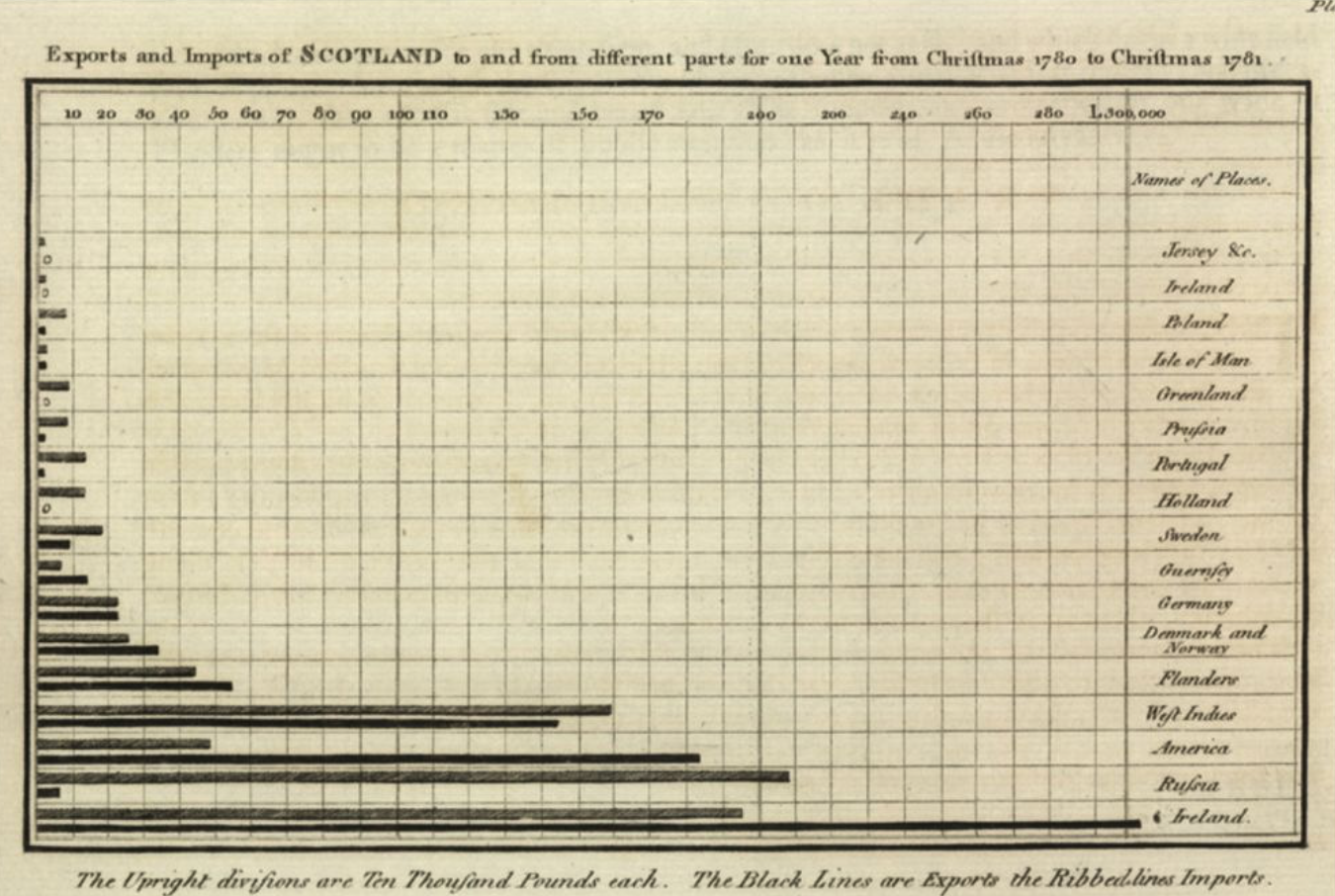
First, we'll recreate the very first known example of a bar chart, which depicts the imports and exports of Scotland to various countries in 1781.
scotland = pd.read_csv('data/playfair-scotland.csv')
scotland
| country | imports | exports | |
|---|---|---|---|
| 0 | Ireland | 195685 | 305167 |
| 1 | America | 49826 | 183620 |
| 2 | West Indies | 169375 | 141220 |
| ... | ... | ... | ... |
| 13 | Greenland | 8291 | 0 |
| 14 | Isle of Man & Jersey | 802 | 1818 |
| 15 | Denmark and Norway | 28118 | 35011 |
16 rows × 3 columns
Let's see how we can make an interactive version of this plot. The library plotly will come in handy here.
fig = px.bar(scotland.sort_values('imports', ascending=False),
             x=['exports', 'imports'],
             y='country',
             barmode='group',
             orientation='h',
             color_discrete_map={
                 'exports': '#151EA6',
                 'imports': '#FCB305',
              },
             title='Exports and Imports of <b>Scotland</b> to and from different parts for one Year'
            )

fig.update_layout(
    font_family="Arial",
    title_font_family="Arial",
    paper_bgcolor='#FFFFFF',
    plot_bgcolor='#FFFFFF',
    legend = {
        'title': '',
        'orientation': 'h'
    }
)

fig.add_annotation( # add a text callout with arrow
    text="no exports to Greenland!", x=10000, y="Greenland", ax=125,
    arrowhead=2, showarrow=True
)

fig.update_xaxes(title_text='',
                 side='top',
                 showline=True,
                 linewidth=2,
                 linecolor='black',
                 mirror=True,
                 showgrid=True,
                 gridwidth=1,
                 gridcolor='#EEEEEE',
                 tick0=0,
                 dtick=25000,
                 tickangle=0)

fig.update_yaxes(title_text='',
                 side='right',
                 showline=True,
                 linewidth=2,
                 linecolor='black',
                 mirror=True,
                 showgrid=True,
                 gridwidth=1,
                 gridcolor='#EEEEEE',
                 tickson='boundaries')
As an aside – what if we want to export this chart to HTML, to put on a website? (Say, for making a data science portfolio?)
The .to_html() method will come in handy.
with open('scotland.html', 'w') as f:
    f.write(fig.to_html())
    f.close()
Wheat and wages
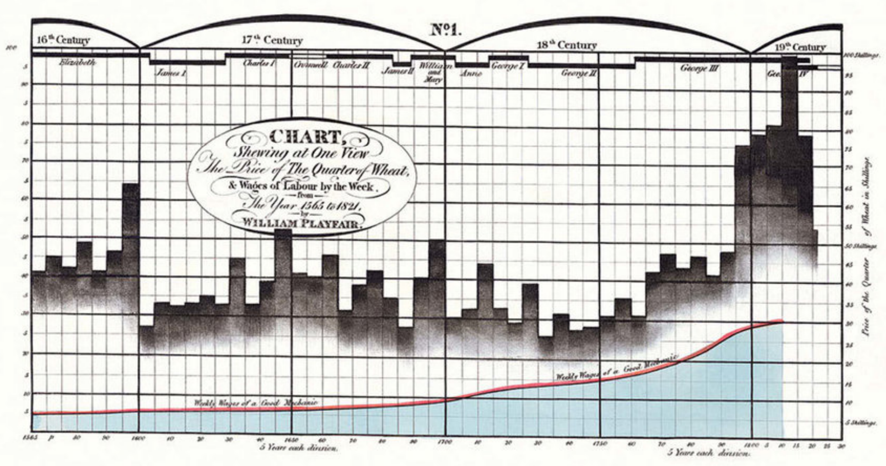
This next plot shows the relationship between weekly labor wages and the cost of a “quarter” of wheat, along with a timeline of English monarchs, from 1565 to 1821.
wheat = pd.read_csv('data/Wheat.csv').drop(columns=['Unnamed: 0']).iloc[:-1]
wheat.head()
| Year | Wheat | Wages | |
|---|---|---|---|
| 0 | 1565 | 41.0 | 5.00 |
| 1 | 1570 | 45.0 | 5.05 |
| 2 | 1575 | 42.0 | 5.08 |
| 3 | 1580 | 49.0 | 5.12 |
| 4 | 1585 | 41.5 | 5.15 |
This task is a bit different, since it involves two different types of visualizations – a line chart and a bar chart.
px.line(wheat, x='Year', y='Wages')
px.bar(wheat, x='Year', y='Wages')
Instead of using plotly.express, which is a "lite" version of plotly, we will use plotly's graph_objects module.
import plotly.graph_objects as go
wheat_fig = go.Figure()

# Add bar chart
wheat_fig.add_trace(
    go.Bar(
        x=wheat['Year'],
        y=wheat['Wheat'],
        name='Wheat',
        marker={'color': '#AAAAAA'},
        width=5
    )
)

# Add line chart
wheat_fig.add_trace(
    go.Scatter(
        x=wheat['Year'],
        y=wheat['Wages'],
        name='Wages',
        marker={'color': 'red'},
        fill='tozeroy',
        fillcolor='rgba(135,206,235,0.65)'
    )
)

# Adjust overall attributes
wheat_fig.update_layout(
    font_family="Arial",
    title_font_family="Arial",
    paper_bgcolor='#FFFFFF',
    plot_bgcolor='#FFFFFF',
    showlegend=False
)

# Adjust x-axis
wheat_fig.update_xaxes(title_text='<i>5 Years each division</i>',
                       tickmode='array',
                       tickvals=[1565, 1600, 1650, 1700, 1750, 1800, 1820],
                       tickangle=0,
                       showgrid=False,
                       showline=True,
                       linewidth=2,
                       linecolor='black',
                       mirror=True)

# Adjust y-axis
wheat_fig.update_yaxes(title_text='<i>Price of the Quarter of Wheat in Shillings</i>',
                       side='right',
                       tick0=0,
                       dtick=5,
                       gridcolor='#EEEEEE',
                       gridwidth=1,
                       showline=True,
                       linewidth=2,
                       linecolor='black',
                       mirror=True)

# Add annotations
wheat_fig.add_annotation( # add a text callout with arrow
    text="<i>Weekly Wages of a Good Mechanic</i>",
    x=1640,
    y=9,
    showarrow=False,
    font = {
        'size': 10,
        'color': 'white'
    }

)

# Add annotations
title_text = 'CHART,<br><i>Showing at One View</i><br><i>The Price of The Quarter of Wheat</i><br>& Wages of Labour by the Week,<br>-- from --<br><i>The Year 1565 to 1821</i><br>-- by --<br><i>William Playfair</i>'

wheat_fig.add_annotation(
    text=title_text,
    x=1640,
    y=70,
    font = {
        'size': 10,
        'color': 'black'
    },
    bordercolor="black",
    borderwidth=2,
    borderpad=4,
    bgcolor="#FFFFFF",
    opacity=1

)

wheat_fig.add_annotation(
    text="<i>Weekly Wages of a Good Mechanic</i>",
    x=1640,
    y=9,
    showarrow=False,
    font = {
        'size': 10,
        'color': 'black'
    }

)
Distribution of the Turkish Empire
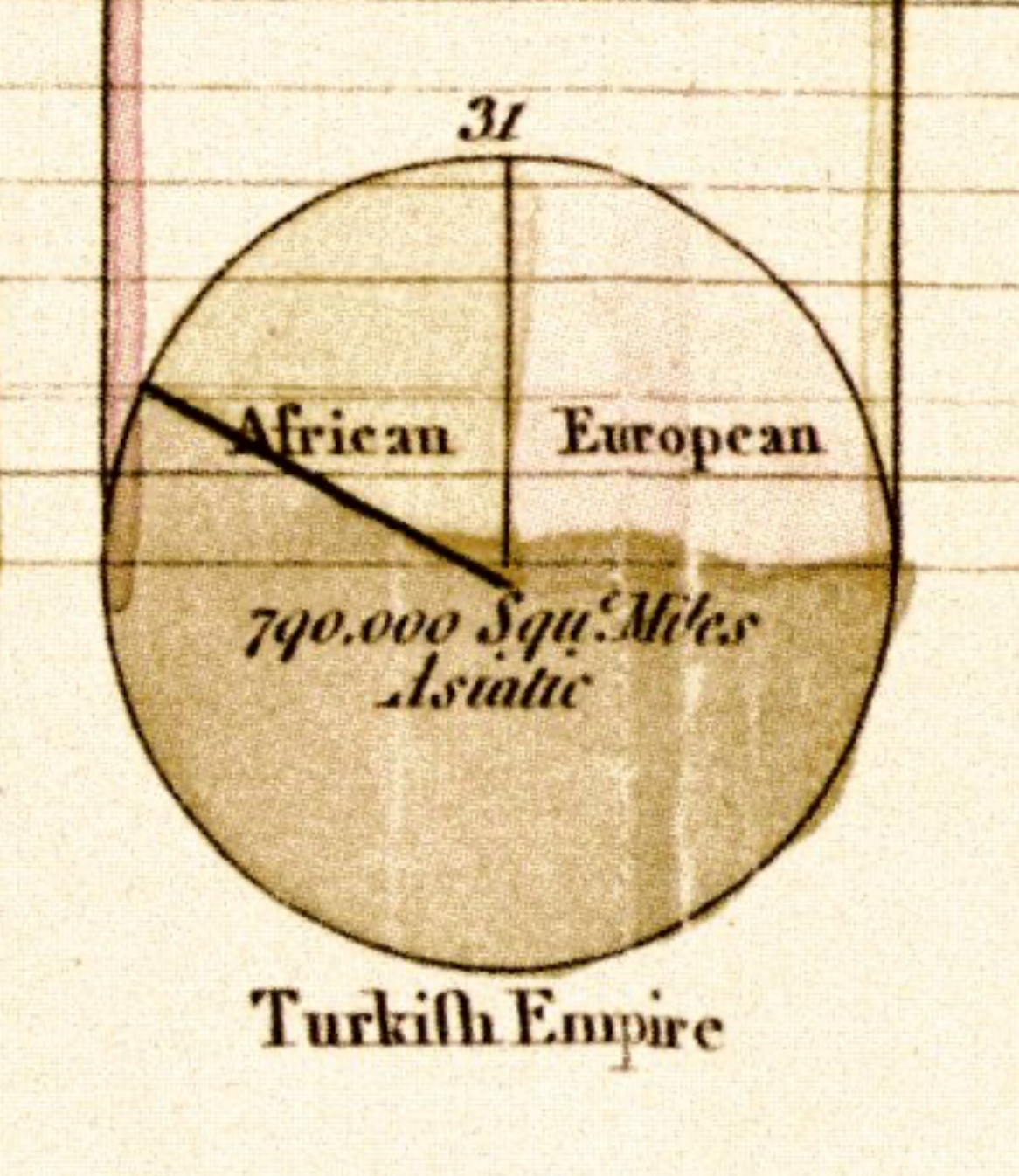
Finally, we'll look at Playfair's first pie chart, describing the land distribution of the Turkish Empire.
dist = pd.DataFrame().assign(
    continent=['African', 'European', 'Asiatic'],
    proportion=[0.2, 0.25, 0.55]
)

dist
| continent | proportion | |
|---|---|---|
| 0 | African | 0.20 |
| 1 | European | 0.25 |
| 2 | Asiatic | 0.55 |
px.pie(dist,
       values='proportion',
       names='continent',
       width=400,
       height=300)
Other examples
Gantt charts (i.e. timelines)
phases = [
 ['Newborn', '1998-11-26', '1999-11-26', 'Canada'],
 ['Toddler, Preschooler', '1999-11-26', '2005-09-03', 'US'],
 ['Elementary School Student', '2005-09-03', '2009-06-30', 'Canada'],
 ['Middle School Student', '2009-09-15', '2012-06-15', 'Canada'],
 ['High School Student', '2012-09-05', '2016-05-30', 'Canada'],
 ['Undergrad @ UC Berkeley', '2016-08-22','2020-05-15', 'US'],
 ['Masters @ UC Berkeley', '2020-08-25', '2021-05-14', 'Canada'],
 ['Lecturer @ UCSD', '2021-09-01', '2024-06-30', 'US'],
 ['Lecturer @ UMich', '2024-08-26', '2024-09-19', 'US']]

phases_df = pd.DataFrame(phases, columns=['Phase', 'Start', 'End', 'Location'])
phases_df
| Phase | Start | End | Location | |
|---|---|---|---|---|
| 0 | Newborn | 1998-11-26 | 1999-11-26 | Canada |
| 1 | Toddler, Preschooler | 1999-11-26 | 2005-09-03 | US |
| 2 | Elementary School Student | 2005-09-03 | 2009-06-30 | Canada |
| ... | ... | ... | ... | ... |
| 6 | Masters @ UC Berkeley | 2020-08-25 | 2021-05-14 | Canada |
| 7 | Lecturer @ UCSD | 2021-09-01 | 2024-06-30 | US |
| 8 | Lecturer @ UMich | 2024-08-26 | 2024-09-19 | US |
9 rows × 4 columns
tim = px.timeline(phases_df,
                  x_start = 'Start',
                  x_end = 'End',
                  y = 'Phase',
                  text = 'Location',
                  title = 'My Life Trajectory',
                  width=700,
                  height=400)

tim.update_yaxes(autorange='reversed')
Animated scatter plots
world = px.data.gapminder()
world
| country | continent | year | lifeExp | pop | gdpPercap | iso_alpha | iso_num | |
|---|---|---|---|---|---|---|---|---|
| 0 | Afghanistan | Asia | 1952 | 28.80 | 8425333 | 779.45 | AFG | 4 |
| 1 | Afghanistan | Asia | 1957 | 30.33 | 9240934 | 820.85 | AFG | 4 |
| 2 | Afghanistan | Asia | 1962 | 32.00 | 10267083 | 853.10 | AFG | 4 |
| ... | ... | ... | ... | ... | ... | ... | ... | ... |
| 1701 | Zimbabwe | Africa | 1997 | 46.81 | 11404948 | 792.45 | ZWE | 716 |
| 1702 | Zimbabwe | Africa | 2002 | 39.99 | 11926563 | 672.04 | ZWE | 716 |
| 1703 | Zimbabwe | Africa | 2007 | 43.49 | 12311143 | 469.71 | ZWE | 716 |
1704 rows × 8 columns
px.scatter(world,
           x = 'gdpPercap',
           y = 'lifeExp',
           hover_name = 'country',
           color = 'continent',
           size = 'pop',
           size_max = 60,
           log_x = True,
           range_y = [30, 90],
           animation_frame = 'year',
           title = 'Life Expectancy, GDP Per Capita, and Population over Time'
          )
Animated histograms
px.histogram(world,
            x = 'lifeExp',
            animation_frame = 'year',
            range_x = [20, 90],
            range_y = [0, 50],
            title = 'Distribution of Life Expectancy over Time')
3D scatter plots
penguins = sns.load_dataset('penguins')
penguins
| species | island | bill_length_mm | bill_depth_mm | flipper_length_mm | body_mass_g | sex | |
|---|---|---|---|---|---|---|---|
| 0 | Adelie | Torgersen | 39.1 | 18.7 | 181.0 | 3750.0 | Male |
| 1 | Adelie | Torgersen | 39.5 | 17.4 | 186.0 | 3800.0 | Female |
| 2 | Adelie | Torgersen | 40.3 | 18.0 | 195.0 | 3250.0 | Female |
| ... | ... | ... | ... | ... | ... | ... | ... |
| 341 | Gentoo | Biscoe | 50.4 | 15.7 | 222.0 | 5750.0 | Male |
| 342 | Gentoo | Biscoe | 45.2 | 14.8 | 212.0 | 5200.0 | Female |
| 343 | Gentoo | Biscoe | 49.9 | 16.1 | 213.0 | 5400.0 | Male |
344 rows × 7 columns
px.scatter_3d(penguins,
             x = 'bill_length_mm',
             y = 'bill_depth_mm',
             z = 'flipper_length_mm',
             color = 'species',
             hover_name = 'island',
             title = 'Flipper Length vs. Bill Depth vs. Bill Length')